
“To boldly go where no design consistency has gone before.”
Buckle up, space cadets — today’s entry on Horrible Covers launches us directly into the budget end of the sci-fi multiverse with Starship Bandits by Yanez and Buzzell. A title that promises interstellar adventure, rogue pilots, and gritty outlaws — but delivers a font-based space crash and an aesthetic that’s more “early Xbox Live” than “space opera epic.”
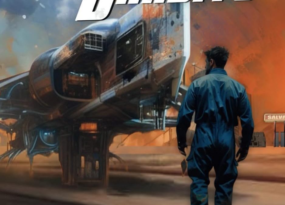
Let’s start with the title: “STARSHIP BANDITS” in all caps, all lean, and all angry. The thick, white, italicized font is warped so violently it looks like it’s bracing for impact. It’s as if someone typed it in normally, then yelled “Now make it EXTREME!” and dragged it across a Star Wars VHS tape. The kerning is clumsy. The beveling is faint. The aggression is… misplaced.
Behind this typographic collision is a reasonably cool starship — or at least it would be, if it weren’t floating awkwardly in a background of rust, dust, and what might be oil smears on a construction site in space. It’s half concept art, half engine trouble. The lighting is inconsistent, and there’s a distinct “smudged render” quality that suggests the ship was halfway to being finished before someone hit export and moved on.
And then there’s our mysterious figure — standing in a flight suit, facing the ship with all the dramatic weight of a video game loading screen. Unfortunately, his inclusion makes the entire composition feel like a collage assembled in Photoshop by a raccoon who’s very into sci-fi. His lighting doesn’t match. His shadow makes no sense. And he looks less like a bandit and more like someone who wandered in from the boiler room.
Zoom in and you’ll spot a “SALVAGE” sign in the corner — which might be the most honest part of the entire design. The whole cover feels salvaged from other, better concepts. It’s not a cohesive vision. It’s the garage kit of book covers.
And finally, the authors’ names: “YANEZ” and “BUZZELL” appear at the bottom like forgotten footer notes. There’s no effort to integrate them — no styling, no balance. Just slapped on in the default font like someone remembered at the last minute that books have authors.
Final Verdict:
A cover that tried to jump to hyperspace before it finished aligning the fonts. It’s Firefly meets Microsoft Paint, and everyone loses.