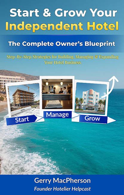
They say you never get a second chance to make a first impression — unless you’re this cover, which seems determined to make zero good ones on purpose. Start & Grow Your Independent Hotel promises a “Complete Owner’s Blueprint,” but visually? It’s more like a crumpled brochure someone left in a hotel lobby circa 2003.
Let’s unpack this suitcase of design sins.
We open with a typographic monstrosity that immediately screams corporate newsletter meets infomercial DVD box. The title’s font work is so offensively loud it might need its own room key. “Start & Grow Your” is a bizarre mishmash of glow effects and gradients that gives the vibe of a LinkedIn inspirational quote generator, while “Independent Hotel” tries its best to be bold — but ends up just bolding itself into obscurity. Oh, and bonus points for the lime green: nothing says “luxury hospitality” quite like “radioactive pesto.”
Then comes the subtitle, which is less a visual element and more a word salad. “The Complete Owner’s Blueprint” is shoved underneath like it’s being punished. Meanwhile, the next layer — “Step-by-Step Strategies…” — is jammed in with a font so thin and lemon-yellow that it’s practically invisible on the turquoise ocean backdrop. It’s giving “accidentally deleted layer mask” energy.
But the pièce de résistance? The three little photo frames labeled “Start,” “Manage,” and “Grow.” These aren’t steps in a business plan — they’re the visual equivalent of hotel buffet leftovers. You’ve got clashing stock images (a construction site-ish hotel, a dimly lit reception, and what might be a retired Instagram filter version of a Miami inn) plopped onto the cover like they were pulled from three unrelated travel blogs.
To top it off, there’s a wonky white arrow weaving through the frames like it’s trying to escape. It points to “Grow,” but really, it should be pointing to the design software’s uninstall button.
The cherry on top? A glowing blue gradient bar across the bottom, capped with white text that feels like it was typed mid-yawn. “Gerry MacPherson, Founder Hotelier Helpcast” is sitting there like it’s waiting for applause, but all it’s getting is a collective side-eye from graphic designers everywhere.
In summary: This isn’t a blueprint. It’s a PowerPoint presentation on its third cup of decaf. If the goal was to evoke the excitement of building and managing a hotel empire, this cover tragically succeeds only in evoking the need for a professional designer… and perhaps an emergency rebranding session.
Check out, please.
