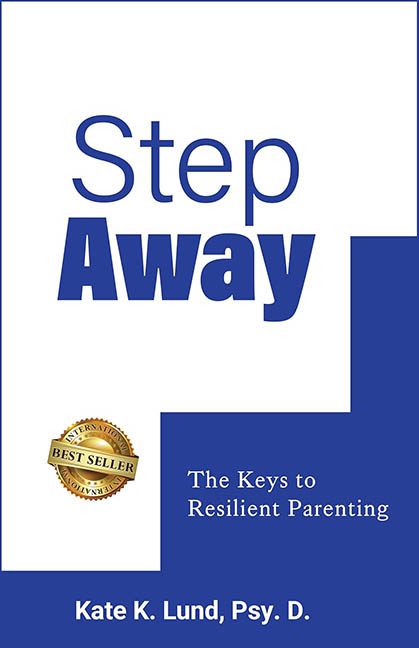
Some book covers whisper. Some scream. And then there’s Step Away, which speaks in the deadpan monotone of a corporate wellness seminar hosted in a hotel ballroom with stale coffee and folding chairs. This isn’t just a bad cover — it’s the graphic design equivalent of being handed a lanyard and told to break into small groups.
Let’s address the elephant in the boardroom: that big white staircase eating the cover alive. It’s supposed to be clever — a visual pun on the title Step Away. But instead of feeling conceptual or clean, it lands somewhere between “Clip Art 101” and “PowerPoint template named ‘Productivity_2_final_FINAL.pptx.’” It’s so aggressively literal, you half-expect the next page to ask you to fill out a feedback form.
Now, the typography. “Step” floats calmly in a thin, sterile sans-serif font, while “Away” arrives like a motivational speaker yelling into a mic: bold, loud, and completely disconnected from its quieter partner. The font pairing has all the chemistry of a forced corporate retreat — technically together, spiritually miles apart. And the poor subtitle, “The Keys to Resilient Parenting”, is tucked into a blue box like it’s serving a quiet sentence for being vague and forgettable. Resilient parenting, you say? The design didn’t even survive Microsoft Publisher.
But wait — there’s more! Slapped onto the lower left corner is the golden seal of shame: the “INTERNATIONAL BEST SELLER” badge. This thing is the book cover version of someone wearing a fake Rolex to a networking event. It’s clip-art level cheesy, painfully out of place, and seems less like an achievement and more like a desperate plea for validation. Nothing says “serious professional resource” like a JPEG ribbon screaming “I made it onto a category list in Kazakhstan for 30 minutes!”
Color-wise, the cover goes all in on blue and white — and I mean all in. Not as a deliberate design choice, but as a surrender. There’s no contrast, no depth, no visual hook. The white staircase cuts through the blue like someone hit “crop” in the middle of designing and then gave up. It’s not minimalist — it’s just underdesigned. The whole aesthetic screams “this was made by someone who thinks Canva is ‘too complicated.’”
There’s no art, no imagery, not even a sad little icon to hint at what’s inside. Just a box. And stairs. And a whole lot of design inertia. This cover doesn’t invite you in — it stands at the front door handing you a pamphlet and asking if you’ve thought about emotional growth today.
Look, we get it. This is a self-help book about parenting and resilience. But the cover has the emotional range of an HR manual and the visual charm of a LinkedIn motivational post. If this cover were a person, it would be nodding enthusiastically while completely misunderstanding the vibe of the room.
In short, Step Away might have something worthwhile to say — but you’d never know it from this painfully generic, layout-by-checklist cover. It’s not just a missed opportunity. It’s a step in the wrong direction.
Someone please design an intervention. Preferably with color, personality, and zero gold stickers.
