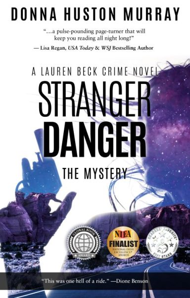
This cover looks like it was designed by someone who couldn’t decide whether the book takes place on Earth, in deep space, or inside a motivational poster from 2009. The purple nebula haze overlays everything like a fog of confusion—appropriate, given that the genre itself seems lost in a multiverse. And while it is a negative space reveal, it lacks that certain something to pull it off.
Is this a thriller or a paranormal romance? The silhouetted woman, complete with windswept hair and handgun, stands awkwardly in front of both an interstellar cloud and desert rock formations. Why the rock formations? Are we solving crimes in Arizona or launching a space tourism startup?
Then there’s the font buffet. “STRANGER DANGER” screams in all caps, aggressively sandwiched between serif and sans-serif cousins who clearly haven’t spoken in years. The subtitle “THE MYSTERY” just in case you forgot this was a mystery, is about as helpful as a GPS saying “You are here.”
And the award stickers. Oh, the stickers. Three shiny seals battling for attention like toddlers on a sugar high. The result? A cover that looks less like a bestselling novel and more like a cereal box announcing “Now with 3 kinds of fiber!”
Color theory went on vacation. White, purple, black, metallic gold—everything clashes. The only crime more jarring than the book’s plot might be the design choices made here.
This isn’t just genre confusion. It’s graphic design whiplash with a side of copy-paste chaos.
