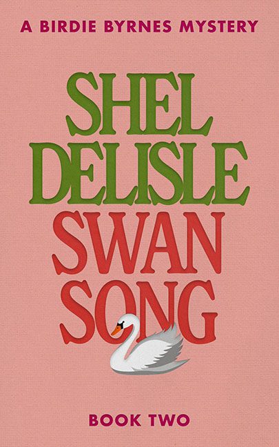
What we have here is not a “Swan Song” — it’s a design whimper softly echoing through the halls of amateur publishing. This cover is less a farewell note and more a shriek from the uncanny valley of cozy mystery branding.
Let’s talk typography, or rather, the absence of typographic logic. “SHEL DELISLE” is rendered in a rigid green serif that somehow manages to be both bold and completely spineless. It’s stacked like a sandwich of missed opportunities — each line tightly pressed against the next as if the letters are afraid to breathe. Is the name the focus? Is the title? Is the swan the main character? Nobody knows. Least of all the designer.
Now onto the title: “SWAN SONG” arrives in a bright red so violently out of step with the pink background it should come with a seizure warning. This isn’t contrast — this is chromatic warfare. The red and green clash like rival Christmas ornaments at a family dinner neither wanted to attend. There’s no visual hierarchy, just a festive facepunch of misplaced enthusiasm.
And then there’s the swan. Oh. The swan. You can almost hear it sighing in existential dread. This isn’t majestic, mysterious, or menacing. It’s a flat, stock-vector hostage, plopped under the word “SONG” as though it’s being crushed by its own narrative weight. The shading on it? A soft gradient blur that screams “PowerPoint 2004” and whispers “Please don’t zoom in.”
The background — a dusty, Pepto-pink fabric texture — tries to say “charming,” but instead ends up somewhere between “expired Valentine’s Day card” and “baby shower invite that lost its soul in a Canva template.” It’s warm, yes. But so is a fever. And this cover has all the visual symptoms of one.
Let’s not ignore the “A BIRDIE BYRNES MYSTERY” line floating at the top like it’s trying to distance itself from the rest of the design. Smart move, honestly. And “BOOK TWO” down at the bottom? It sits alone in a purple-ish tone that doesn’t match a single other color, like someone accidentally spilled a different book onto the cover and said, “Eh, leave it.”
The whole thing feels like it was created during a frantic lunch break by someone whose only design experience involves rearranging magnets on a novelty fridge. It’s not minimalist. It’s just barely trying.
Ultimately, this cover is a mystery in itself:
Who did this? Why did they do it? And how many innocent fonts were harmed in the process?
If this swan is singing, it’s a tone-deaf rendition of “Design Principles Be Damned.”
