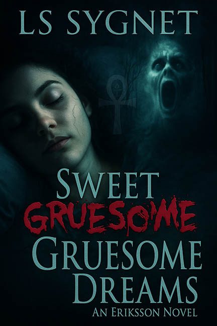
If nightmares could hire a freelance designer, Sweet Gruesome Dreams would be the result. This cover isn’t scary because of its subject matter — it’s terrifying because of its design decisions.
Let’s start with the construction. This isn’t one cohesive image; it’s a Frankenstein’s monster of stock photography. A woman peacefully sleeping. A screaming ghost face. A random ankh symbol glowing faintly in the fog. None of these things belong together, and yet here they are, photoshopped into a single image like three separate PowerPoint slides mashed into one.
The sleeping woman looks fine at first glance — until you notice the unnatural lighting and that oddly emphasized vein crawling down her temple like it’s auditioning for a leading role. She’s meant to look peaceful, but the lighting says “crime scene photo.” Then, a few inches away, we have the ghostly face. It’s not emerging from the shadows so much as floating awkwardly beside her, like a friend who doesn’t understand personal space. And then — because no bad horror cover is complete without a touch of the random — we get an ankh symbol glowing in the background for reasons no one can explain. Egyptian iconography? Spiritual symbolism? Or just another asset tossed in because the designer found it in the “Spooky Clip Art” folder?
The typography tells its own tale of chaos. “Sweet Gruesome Dreams” tries to be clever by mixing two fonts: elegant serif for “Sweet” and “Dreams,” and red slasher scrawl for “Gruesome.” In theory, that contrast could work. In practice, it looks like two fonts met at a bar, had a disagreement about tone, and refused to speak again. The word “Gruesome” isn’t integrated; it’s slapped on like a bloodstained sticker that says “LOOK, HORROR!”
Meanwhile, the author’s name and tagline sit quietly above and below, using the same bland typeface, contributing nothing to hierarchy or mood. And let’s not skip the pièce de résistance — the phrase “An Eriksson Novel.” Because when your cover already shows a ghost, a vein, and a glowing symbol, the one thing you definitely need is a line clarifying that it’s… a novel. Just in case anyone thought it was an IKEA instruction manual for the undead.
The color palette is your standard “horror teal filter” special: everything tinted in that eerie underwater blue that says, “We discovered the Hue/Saturation tool and we’re not afraid to overuse it.” The result is a murky image that looks more like it was dunked in aquarium water than wrapped in mystery.
There’s nothing sweet or dreamy here — only a nightmarish collage of genre clichés fighting for dominance. It’s as if the designer typed “horror” into a stock photo site, downloaded the first three results, and said, “Perfect, ship it.”
In the end, Sweet Gruesome Dreams is a cover that promises horror but delivers only Photoshop purgatory. It’s gruesome all right — just not in the way it intended.
