There’s minimalism, and then there’s this.
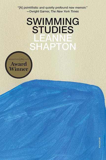
Swimming Studies presents itself as an award-winning literary memoir, but visually it’s less “artful restraint” and more “someone fell asleep in Adobe Illustrator.” Over half the cover is a wide, unbroken expanse of beige — not a soft, warm, elegant beige, but the exact hue of an office cubicle wall circa 1997. It’s a color that makes you forget what enthusiasm feels like.
And then, without warning, there’s a giant blue blob at the bottom. Not a stylized wave. Not an abstract ocean. Just a blunt, lumpy MS Paint brushstroke that looks like it gave up halfway across the page. It’s flat, oddly shaped, and unconvincing as anything but proof that the designer once owned a mouse. This isn’t a visual metaphor for swimming — it’s a screenshot from someone testing opacity settings and calling it profound.
The rest of the design is eerily vacant. The title and author’s name hover awkwardly above the beige void, typeset in plain white and black sans serif like a PowerPoint slide that got promoted too soon. “SWIMMING STUDIES” stacks neatly enough, but there’s no visual rhythm — no energy, no texture, no pulse. Just text doing its taxes.
Then there’s the award sticker, slapped onto the open space like a last-minute apology for how little is happening elsewhere. “National Book Critics Circle Award Winner,” it declares proudly, as if trying to distract us from the design’s existential emptiness. It’s the only thing with life on the page, and it’s an add-on.
Compositionally, the cover is a mess. The beige dominates, the blue sulks in a corner, and the typography floats somewhere in between, pretending they all belong to the same artistic conversation. They don’t. The whole thing feels less like Swimming Studies and more like Waiting Room Studies.
This is the kind of design that thinks it’s making a statement, but the only thing it’s really saying is, “I went to art school and now I’m afraid of color.” It’s minimalist in the way a blank spreadsheet is minimalist — quiet, yes, but only because it has nothing to say.
So while critics might call it “understated” or “elegantly simple,” let’s be honest: it’s pretentious beige with a blue smudge. It’s the visual equivalent of a monotone whisper asking you to find meaning in a wall.
If this is Swimming Studies, the designer must have stayed in the shallow end — floating aimlessly, avoiding waves, and proudly declaring,
“Look, I made art by doing almost nothing.”
