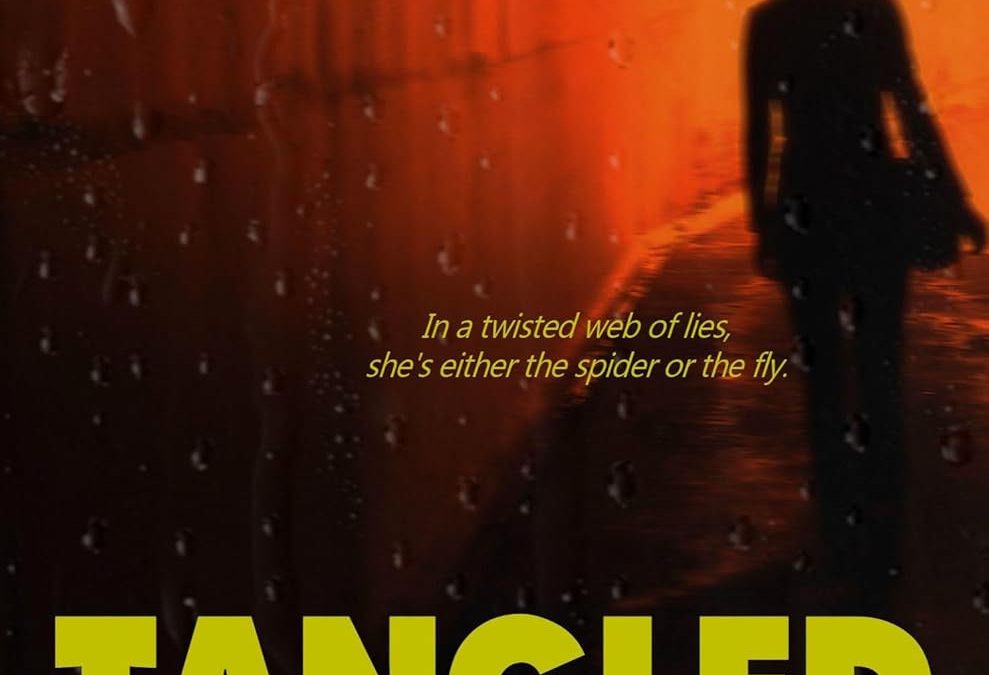

Imagine walking into a dimly lit bookstore, mist curling at your ankles, when this cover slaps your eyeballs with the force of a flashlight beam at 3 a.m. Ladies and gentlemen, Tangled Darkness has arrived – and it brought every available shade of traffic-cone orange and banana-highlight yellow with it.
Let’s start with the font:
The title screams “TANGLED DARKNESS” as if it were trying to warn us of a bad restaurant health inspection. Is it bold? Yes. Is it effective? Only if the goal was to look like a stencil from a 1970s hazmat manual. And the author’s name? Also loud. Also yellow. The graphic designer clearly thought, Why whisper when you can scream?
Then there’s the mood:
Is the background a tunnel? A puddle of hot sauce? A dystopian sewer system dipped in Sriracha? We may never know. The shadowy silhouette of a woman walks purposefully toward (or away from?) an ominous light source, like she’s auditioning for the world’s saddest shampoo commercial.
The raindrops:
We get it – emotions. But the fake rain texture looks like someone misted their iPad with Windex and hit “Save As Final.” It’s atmospheric in the way that hot breath on cold glass is: unintentional and vaguely uncomfortable.
The tagline:
“In a twisted web of lies, she’s either the spider or the fly.” Sounds deep, but paired with this imagery, it reads more like, “She’s either lost… or even more lost.” The vibe? Urban thriller meets motivational poster found in a damp basement.
Final Verdict:
This cover tangles with darkness and loses. If you like your thrillers dipped in Velveeta and viewed through a wet windshield – congratulations, you’ve found your next read. But for the rest of us? Let’s just hope the inside is better dressed than the outside.