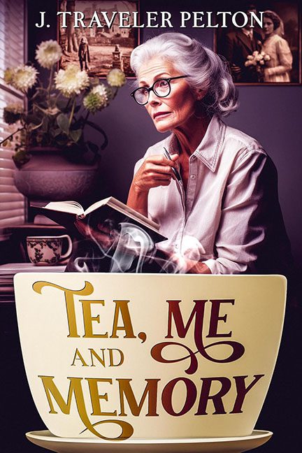
Covers are supposed to give you a sense of the story. Tea, Me and Memory gives you a sense that your grandmother is silently judging you for not calling more often.
Let’s start with our leading lady: perched at a table, book in hand, side-eyeing us like we just double-dipped at her holiday party. She doesn’t exude warmth, or nostalgia, or even comfort — she radiates the energy of a woman who’s about to send back her tea because it’s two degrees too cold.
Now, about that giant mug of doom. Taking up the entire bottom third of the cover, it looks like a prop from a low-budget fantasy where someone wished for “all the tea in the world” and immediately regretted it. The perspective is completely off, so instead of blending into the scene, it looks like it’s been dropped in from a parallel dimension of clunky Photoshop layers.
Typography isn’t helping matters. “Tea, Me and Memory” is wedged awkwardly inside the mug in a Frankenstein mashup of fonts — some curly, some stiff, none working together. It’s less “thoughtful reflection” and more “graphic designer got lost in Microsoft WordArt circa 2002.”
The background tries to help, but ends up as visual clutter. Blinds, flowers, sepia-toned photo — it’s giving “stock photo mood board” rather than atmosphere. If this is supposed to say cozy, it misses the mark and lands somewhere around claustrophobic thrift store chic.
And the tone? The title suggests warmth, gentle nostalgia, and reflective storytelling. The cover delivers giant crockery, font confusion, and a woman who looks like she’s plotting revenge. Instead of cozy, we get soap opera melodrama served lukewarm.
The verdict? Tea, Me and Memory might be a heartfelt book, but the cover is a design disaster. Between grandma’s death stare, the mug that ate Manhattan, and typography crimes galore, this is one tea party that should’ve been canceled.
