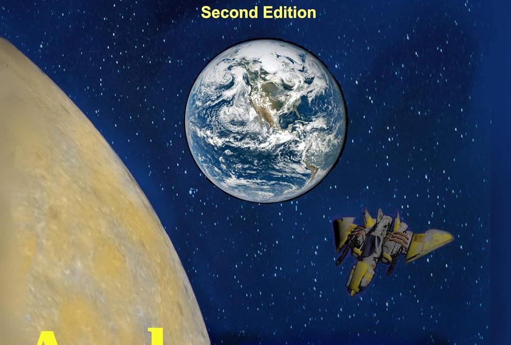
There are book covers that make you stop and stare in awe. And then there are book covers that make you stop and stare because you genuinely can’t believe someone looked at the final result and said, “Yes. This is it.” Terra’s Evil Children falls firmly, unapologetically, and gloriously into the latter category.
Let’s set the scene: In a universe where graphic design is treated less as an art form and more as an afterthought, one cover dares to boldly go where no layout should go.
We begin with the title—TERRA’S EVIL CHILDREN—shouting in full caps, bright yellow, like a warning sign you might see outside a condemned uranium mine. Right beneath that, in a shy and awkward whisper, “Second Edition” makes an appearance, as if even it is unsure why it’s here. Did something change between editions? Was the spaceship repainted? Did we finally figure out what planet that yellow ball is?
Ah yes—the yellow ball. Presumably a planet, it has the unfortunate appearance of either a poorly airbrushed cantaloupe or a wax sculpture that’s spent too long in the sun. Its texture is flat, its color questionable, and its placement odd, consuming nearly a third of the cover in an act of gravitational design tyranny.
Then we move to the center: Earth. A perfectly crisp, high-resolution satellite photo—clearly borrowed from NASA’s public domain offerings or Google Images after a daring “Right-click > Save As” maneuver. It’s too sharp, too real, and too visually incompatible with the soft, dreamy starfield behind it. It’s like someone glued a National Geographic insert onto a 90s sci-fi VHS cover.
And what sci-fi landscape would be complete without a spaceship? Behold: the fighter jet. A small, yellow, angular craft tucked awkwardly in the corner like a child who showed up at the wrong costume party. It appears to have been ripped straight out of a Wing Commander fan mod from 2003. The lighting doesn’t match. The scale is confusing. The direction it’s flying is unclear. Is it attacking Earth? Escaping Terra’s evil offspring? Trying to find the exit from this design nightmare?
The author’s name, Andrew van Aardvark, is splashed across the bottom in that same hostile yellow. No kerning. No padding. No shame.
There is no cohesive theme, no visual harmony, no spatial logic. Every element is doing its own thing in isolation, like the cover was assembled from a ransom note made entirely of stock images and 1998 PowerPoint templates. It’s the kind of layout that feels less like a sci-fi thriller and more like a visual dare.
And yet—somehow—it exists. It dares. Just like the children of Terra, this cover has rebelled against the rules of good taste, proportion, and digital rights management. And in doing so, it’s achieved something rare: a cover so baffling, so bravely misaligned, that you just might want to read the book… out of sheer morbid curiosity.

