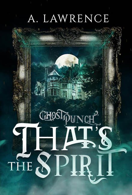
When a cover tries to whisper “playful paranormal adventure” but instead shouts “graphic design séance gone wrong,” you get That’s the Spirit, a visual buffet of every ghost‑themed cliché stirred into one overcaffeinated cauldron. This isn’t a cover so much as a mash‑up of design decisions yelling over each other in the fog.
Let’s start with the typography, because the typography certainly started without us. “THAT’S THE SPIRIT” arrives in a chaotic storm of swirling serifs and theatrical curls, like each letter is independently possessed and refusing exorcism. “SPIRIT” in particular is bending and twisting like it’s trying to escape the book entirely, while “THAT’S” sits above it in a totally different style, looking mildly embarrassed to be there. And floating above all this is “GHOSTPUNCH,” delivered in a cracking, jagged font that seems to have been pulled straight from the Reject Pile of Haunted House Logos. Three fonts, zero cohesion, infinite design crimes.
But why stop at font mayhem when you can add visual clutter? Enter the fog—so much fog. Fog behind the title. Fog in front of the frame. Fog creeping around like it paid for VIP access. The color is that overly saturated teal that screams “paranormal mystery… or maybe vape shop.” It drowns the lower half of the cover while doing nothing to unify the visuals.
Then we have the ornate picture frame, a dramatic antique rectangle plopped into the center like a portal to a different design entirely. Inside it sits a haunted mansion lit by a huge glowing moon that looks like it was borrowed from three different lighting schemes at once. The frame doesn’t feel attached to anything; it hovers in space like an awkward prop from a ghost‑themed escape room. The mansion inside is detailed and moody, but it’s fighting the fonts, fog, and frame for attention in a battle nobody wins.
And that’s the heart of the problem: this cover has no visual hierarchy. Everything is screaming at the same volume, all at once. Is the haunted house the star? The title? The frame? The fog? The moon? The teal glow? The answer is yes—every element is trying to headline the show. It’s exhausting.
Ultimately, That’s the Spirit is the design equivalent of a paranormal variety hour where all the acts perform simultaneously. It could have been spooky‑fun or charmingly camp, but instead it’s a tempest of mismatched fonts, smothering smoke, and a Victorian frame begging to be set free. This cover doesn’t just lack spirit; it’s haunted by every design decision made along the way.
