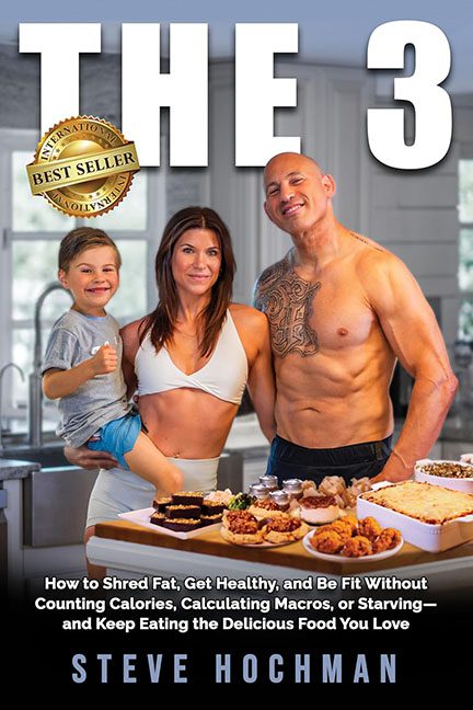
Get ready to flex your disbelief, because today’s disasterpiece is brought to you by the number 3—and the design team that clearly gave up after it.
Welcome to the shiny, shirtless chaos that is The 3 by Steve Hochman, a cover that raises many questions and answers none of them. What is “The 3”? The three people? The three carbs? The three warning signs of a bad layout? Whatever it is, this cover isn’t telling you—it’s too busy hitting the gym and rubbing coconut oil on your screen.
Let’s start with the main attraction: our trio of protagonists—a fitness couple and a child who looks like he was dragged into this photoshoot from a much happier place. The dad is shirtless, tanned within an inch of his life, and flexing hard enough to burst a protein bar. The mom is giving solid “Instagram fitness coach trying to ignore the chaos” energy. And the kid? He looks like he was Photoshopped in from a stock photo titled “Happy toddler high-fiving carbs.”
Now, the composition. Or should we say non-composition? Everyone is awkwardly spaced like they’re attending a networking event for mismatched lighting. The dad is leaning in from the side like he photobombed his own book cover, and no one’s making eye contact with each other, or with reality.
And then… the food. Oh dear. The countertop is a buffet of nutritional confusion: meatballs, donuts, deviled eggs, sushi maybe?, and what appears to be a protein tray from a grocery store sampler platter. Is this a cookbook? A nutrition plan? An apology letter to your arteries? The subtitle claims this is about shredding fat, getting healthy, and not counting calories—while the imagery screams “holiday cheat day but make it weird.”
Let’s not skip the title, which has the elegance of a license plate:
THE 3
Three what? Steps? Secrets? Sausages? It’s written in giant, default Microsoft Word font, looming over the kitchen like it’s been sentenced to stand there forever, bold and baffling. The subtitle underneath tries to explain the concept in a breathless run-on sentence, like a desperate personal trainer yelling through a wind tunnel.
And then there’s the “International Bestseller” sticker, slapped on like a golden participation trophy from the Photoshop Olympics. It’s not even integrated—just hovering awkwardly like it’s waiting for someone to notice and validate it.
Altogether, The 3 isn’t just a bad cover—it’s an identity crisis wearing gym shorts. It wants to be motivational, nutritional, aspirational, and domestic—but instead lands squarely in “awkward fitness MLM brochure left in your mailbox by mistake.”
In the end, The 3 teaches us that you really can eat what you want, ignore design fundamentals, and still get your book printed.
But should you?
That’s mistake number four.
