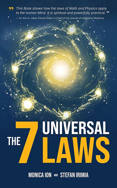
Some covers promise the secrets of the cosmos. This one promises the secrets of a Microsoft PowerPoint template. “The 7 Universal Laws” should feel like a grand cosmic revelation, but instead, it looks like someone Googled “galaxy clip art” and clicked download. The glowing spiral at the center is supposed to symbolize infinity and mystery, but it really just screams “desktop screensaver from 2003.”
Then there’s the typography — oh boy. The giant yellow “7” looms like it’s about to eat the word “UNIVERSAL” whole. The bold sans-serif font works fine for a political campaign sign or an airline safety brochure, but not for a book claiming to explain the fundamental laws of existence. It’s the design equivalent of being handed the secrets of the universe… written in Comic Sans on a sticky note.
To make matters worse, the cover feels like a fight for dominance: blinding sun flare in the middle, galaxy dots spiraling around like they’re late to rehearsal, a blaring title smashed into the bottom, and a random endorsement floating at the top like a forgotten sticky label. Every element is shouting “LOOK AT ME!” while none of them are saying anything profound.
If these are the seven laws holding the universe together, then no wonder Mercury is always in retrograde. This isn’t the majesty of universal truth — it’s a TED Talk thumbnail in outer space drag.
