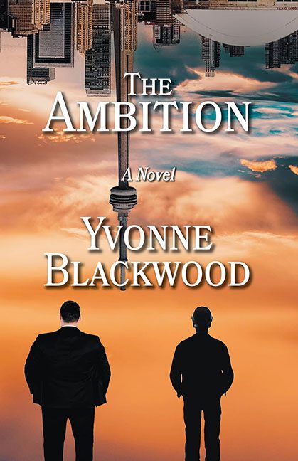
The Ambition promises high stakes, bold dreams, and life-altering pursuits — and then delivers a cover that looks like a motivational poster got caught in a wind tunnel and landed in a pile of free stock images.
Let’s start with the obvious: the Toronto skyline is upside down.
Is this a metaphor? A statement on societal collapse? An artistic cry for help? Or did someone just drag the layer the wrong way and say, “That’ll do”?
Dead center is the CN Tower, descending from the heavens like a divine antenna, slicing through the middle of the cover like it’s preparing to beam someone directly into Graphic Design Purgatory.
This cover doesn’t just lack subtlety — it reverses it at 3000 feet.
Now gaze downward (or is it upward?) to the two men standing solemnly in the foreground. They appear to be stock photo business bros, gazing longingly at a Photoshop sunset that looks like it came preinstalled with Windows Vista. Their silhouettes are pasted on with all the finesse of a child’s school project, and the scale?
Utter nonsense.
Either the CN Tower is a decorative paperweight, or these guys are 800 feet tall and about to play shuffleboard with downtown Toronto.
And then there’s the typography.
“The Ambition” is rendered in your friendly neighborhood Times New Roman cosplay, white with the obligatory drop shadow for that just-discovered-layer-styles flair.
“A Novel” floats under it in italics, looking like it was added at the last second with the default font tool and a shrug.
And the author’s name, Yvonne Blackwood, sits smack in the middle of the cover — proud, centered, and breaking the line of the CN Tower like it’s slicing through time and space just to get to her author credit.
The overall vibe?
LinkedIn profile meets dystopian screensaver.
It wants to be Inception but ends up as PowerPoint Presentation: The Reckoning.
But the biggest mystery of all?
What is this book actually about? Is it a corporate thriller? A journey to the top? An allegory for ambition’s self-destructive tendencies?
No clue.
The only ambition on this cover is the designer’s — and even that got flipped upside down somewhere in post-production.
This isn’t just bad design.
It’s an architectural cry for help layered over a gradient sky and glued together with ambition, misalignment, and Microsoft fonts.
Final verdict: Ambition was present. Execution called in sick.
