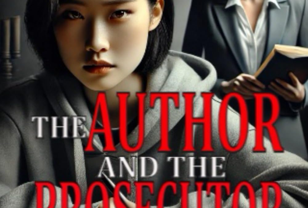

Some covers whisper mystery. Others scream suspense. But The Author and the Prosecutor? It bellows “Courtroom Drama!” with the subtlety of a bullhorn in a library — if the library were hosting an amateur Photoshop competition.
First, we need to talk about the typography. Nothing says “gripping legal thriller” like “AUTHOR” and “PROSECUTOR” in emergency-alert red, shouting at you like they’re trying to jump off the page and plead their case. The rest of the title slinks by in a smaller, silver font — perhaps it knew better than to stand trial next to its louder companions.
Front and center is our protagonist, locked in an intense glare that suggests she’s either solving a case or trying to remember if she left the stove on. Her expression may be blank, but her commitment to that thick hoodie says “plot twist imminent.” Behind her looms a mysteriously well-lit woman in a blazer, holding a book like she’s just been asked to read aloud in court. Perhaps she’s the prosecutor, or maybe just someone who wandered into the wrong book cover.
Let’s not overlook the writing journal, full of cursive so stylized it makes ancient scrolls look like Arial. It’s dramatic. It’s moody. It’s illegible.
In short, this cover feels like the jury’s still out — on everything. Composition, theme, mood… all pending appeal.

Our Suggested cover for this work
1. Composition and Focus
The image composition is thoughtfully balanced, placing the main character at a desk in the foreground, with another figure standing in the background. This setup creates depth, visual interest, and a subtle narrative tension that fits the genre. The open desk space also allows room for clean typography, ensuring the title and author name are legible without overlapping key visual elements.
2. Genre and Setting Clarity
The backdrop of law books and the presence of justice scales immediately cue the legal drama setting. Readers don’t need to guess the genre—everything about the environment confirms it. The cover sets expectations right away, which is essential for marketability.
3. Emotional Tone
The characters’ expressions are serious and contemplative, hinting at mystery, conflict, or intellectual struggle. It avoids melodrama and instead captures a mature, grounded tone—ideal for a legal or psychological thriller. The subdued emotional cues invite curiosity without being overbearing.
4. Visual Hierarchy and Readability
Ample negative space around the characters allows for strategic text placement. This ensures that the title and author name remain readable across devices and sizes, a critical feature for online visibility.
5. Audience Relevance
The contemporary clothing and setting will resonate with modern readers, while the classic library setting adds credibility and gravitas. It speaks directly to readers who enjoy smart, character-driven stories with a legal or investigative angle.
6. Professional Polish
This cover feels intentional, cohesive, and genre-appropriate—hallmarks of strong design. It avoids amateur pitfalls like clutter, unclear imagery, or mismatched fonts. As a result, it positions the book as credible and worth the reader’s time.