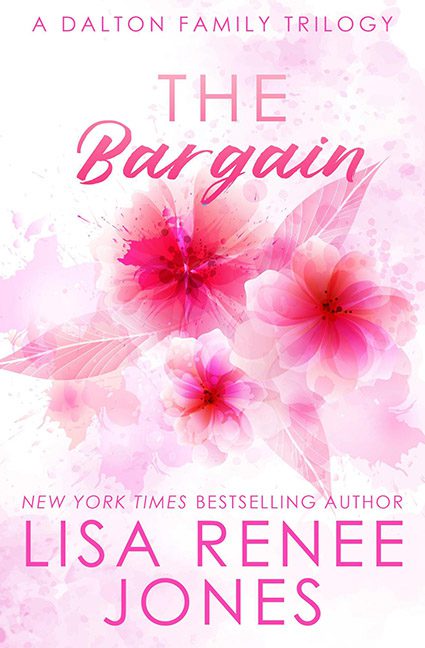
What we have here, ladies and gentlemen, is not so much a book cover as it is a Pepto-Bismol commercial in paperback form. The Bargain looks less like a steamy romance and more like the box art for “cheap floral tissues” at your local dollar store.
First, let’s talk about that color palette. Pink on pink on pink, with a hint of—you guessed it—more pink. It’s as though someone shouted “romance means pink!” at a graphic designer who then proceeded to empty every watercolor brush pack from Canva onto the canvas until it resembled the aftermath of a cotton candy explosion. Romance doesn’t need to scream neon rosé to get the point across. This is less passion, more Pepto.
The flowers themselves are the stock art equivalent of a last-minute Valentine’s Day card bought at the gas station. They float across the page like ghostly clip art, fighting desperately for attention but blending into the background so badly that the text gets lost in the floral fog. And speaking of the text—“The Bargain” is in a shade so close to its surroundings that it basically vanishes. It’s supposed to be the title, not a game of “Where’s Waldo?” in fuchsia camouflage.
Then there’s the typography. One font is screaming romance chic, the other looks like it wandered in from a self-help seminar. Nothing about this layout feels balanced or considered. It’s all just… slapped together, as if someone’s main design software was Microsoft Word 2003.
Worst of all, this cover tells you absolutely nothing about the story. Is it contemporary romance? Historical? Paranormal? All I see are flowers and a pink haze, which could just as easily be marketing for a bubble bath brand as it could be a novel. There’s no hook, no intrigue, nothing but a generic pink fogbank of design laziness.
This cover isn’t a bargain — it’s an overpayment in every possible way.
