There are bad covers that offend the eye, and then there are bad covers that offend geometry, anatomy, and logic. The Best Cadet manages to do all three while still looking like a brochure you’d get at an underfunded leadership seminar.
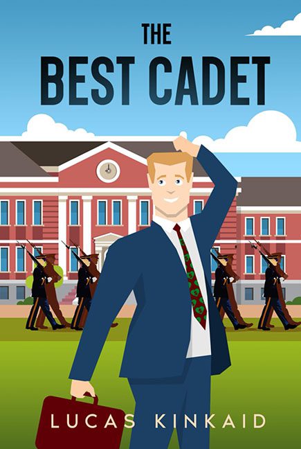
Right away, you’re greeted by our hero — an unnervingly plastic-looking man in a blue suit, standing in front of what appears to be the world’s most generic military academy. Behind him, a squad of identical cadets marches in perfect vector formation, rifles raised in unison like synchronized mannequins from a patriotic IKEA display.
The main character, meanwhile, looks like he wandered in from a PowerPoint presentation titled “How to Excel at Excellence.” His hand rests awkwardly on his head, frozen in that classic gee-whiz, I forgot how human movement works! pose. His expression says, “I’m confident and relatable!” but his face says, “I’m a tax deduction.”
And the tie — oh, the tie. A chaotic red-and-green pattern that feels like Christmas threw up on a business major. It’s the only splash of personality in the whole image, which is saying something when your competition is a brick wall and five identical cadets doing gun ballet.
Let’s talk about the art style. Flat vector illustration can work — when it’s sleek, consistent, and stylized. But here? It’s like Canva and Clip Art 2007 had a child and sent it to military school. Every line is clean but soulless, every color saturated but hollow. There’s no shading, no depth, no life — just layers of polite mediocrity arranged in near-perfect symmetry.
Even the title — The Best Cadet — floats blandly above the character in an all-caps sans serif font so default, it could have been named “Font.” It doesn’t inspire confidence or intrigue. It just kind of… exists. Like the designer thought, “Eh, it’s centered, good enough.”
And what’s the story here? The title promises the best cadet — the paragon of discipline, valor, and youthful idealism. But the cover gives us an anxious accountant at parade rest. Is he the cadet? Is he visiting the cadets? Is he lost on campus and trying not to ask for directions? The narrative confusion is so thick you could spread it on toast.
In the background, the red-brick building looms, perfectly symmetrical, perfectly dull — the architectural embodiment of “We ran out of budget.” The marching figures add energy, sure, but only in the way a stock animation loop adds energy to a loading screen.
The color palette? Fine, in the way that oatmeal is fine. Blue suit, red building, green lawn, blue sky — everything perfectly acceptable, perfectly safe, perfectly boring. There’s not a single unexpected design choice, unless you count “making your main character look like he’s holding in a sneeze.”
So, what we have here is not The Best Cadet. It’s The Most Confused Clip Art.
A cover so clean, so polished, and yet so emotionally empty that it could double as corporate art for an HR orientation room.
In the end, The Best Cadet isn’t just a bad cover — it’s a leadership failure in vector form. It salutes you with one hand and silently pleads for better design with the other.
