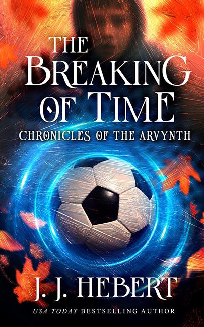
There are genre mashups… and then there’s The Breaking of Time, where fantasy, science fiction, and youth soccer collide in a design decision so baffling, it may have actually broken the time-space continuum.
Let’s begin with the obvious: the soccer ball. Right there. Front and center. Glowing. Vortexed. Heroic. Nothing says “Chronicles of the Arvynth” quite like a standard-issue black-and-white ball from aisle 9 at Walmart. The ball isn’t ancient, enchanted, or even stylized to fit the supposed epic nature of the book. It’s just… a soccer ball. Floating mid-magic circle like it’s been summoned by an 11-year-old wizard who just wanted to play five-a-side with some orcs.
Now, if this were a story about a chosen one who bends time by bending it like Beckham, we’d at least understand the visual choice. But paired with the melodramatic fantasy title, the ornate serif fonts, and a vague, cloaked background figure blurred out like they’re in witness protection, this whole cover feels like three genre ideas got into a bar fight and the soccer ball won.
Let’s talk composition. The fiery leaves—or are they fragments of burning time?—are scatter-blasted around the frame, layered over a swirling energy vortex that seems stolen from the Doctor Strange school of overly enthusiastic graphic effects. None of it matches. The lighting on the soccer ball is all wrong, the fire looks copy-pasted from a free stock asset pack, and the entire image feels like it was composed using drag-and-drop design in a moving car.
Typography gets no reprieve either. “THE BREAKING OF TIME” is stacked in classic “serif shouting” fashion, and while technically clean, it reads more like a YA time-travel novel than anything connected to mystical soccer prophecies. “Chronicles of the Arvynth” adds to the confusion with a font choice that belongs on the back of a dusty VHS tape about medieval rune lore. And poor “J.J. Hebert” sits at the bottom like he wandered into the wrong cover and is now stuck watching this flaming, time-warping match from the sidelines.
And that background figure? Unclear. Blurry. Mysterious. Possibly photoshopped in with a 60% opacity and 100% lack of clarity. Are they a timekeeper? A fantasy hero? A substitute coach? No one knows. They stand in dramatic profile, engulfed in magical swirls and graphic indecision.
Final score: Genre – 0, Confusion – 10.
Verdict: This cover looks like what happens when someone tries to describe a fantasy novel while being tackled during a soccer match. The Breaking of Time isn’t a book cover—it’s a collision event between fantasy ambition and sports stock photography, and no one made it out unscathed.
