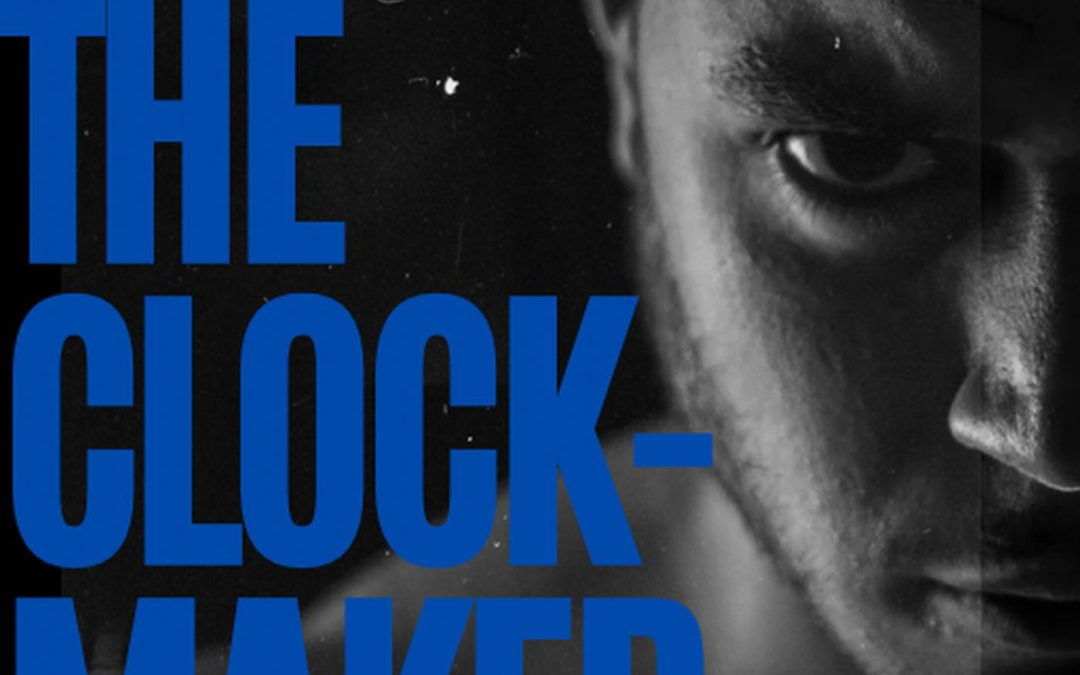

Ah, The Clock-Maker. A title brimming with the promise of intricate gears, delicate craftsmanship, and maybe an eccentric old man in a waistcoat. Instead, what we get is a shirtless man glaring into our souls like we just scratched his Ferrari — and not a single clock in sight. This is horology by way of an intense police interrogation.
The composition is pure “Netflix docuseries you click by accident at 2 a.m.”: harsh shadows, monochrome dread, and typography that looks like it was slapped on by someone who heard about graphic design once but didn’t have time to actually Google it. “THE CLOCK-MAKER” is written in massive, electric blue block letters, which absolutely dominate the image — because nothing says winning mentality like covering half your own subject’s face with Comic Sans’ angry cousin. And the hyphen? It sits there like a passive-aggressive reminder that even the title wants to break up.
Then, nestled meekly at the bottom in a timid typewriter font, the subtitle: How to Have a Winning Mentality. Imagine handing someone a Rolex box, only for them to open it and find a note that says, “Try harder.” That’s this subtitle. It’s decorative at best, confusing at worst.
And the author’s name? Poor Kobie Stevenson has been banished to the top corner like a freshman too shy to sit with the cool kids. Two different fonts are used on the same cover like a ransom note assembled by a motivational speaker.
The result is a visual identity crisis: Is this about sports? Crime? A moody perfume ad? Or is it, as the title suggests, about a man who literally makes clocks? Spoiler: if he does, he’s hiding them off-camera, probably next to the rest of this book’s missing design elements.
If the goal was to create a cover that stops time, congratulations — I stared at it for five minutes trying to figure out what it’s even about.