
The Darker Days wants to plunge you into a world of mystery, shadows, and high-stakes drama—but instead, it plunges you straight into a design black hole where perspective dies, moons expand without warning, and spell-check is but a myth.
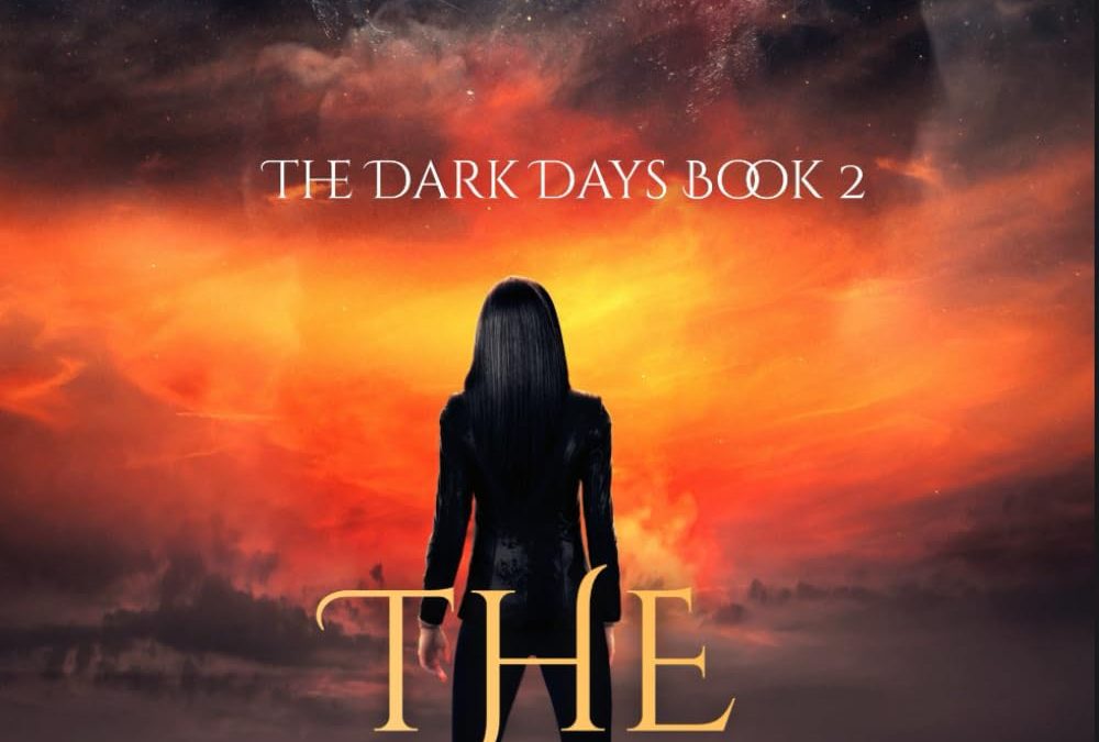
Let’s start with the lunar elephant in the room: that moon. It’s not just full—it’s overqualified. This isn’t a romantic moon. This is a final boss moon. It takes up half the sky like it’s about to crush the Earth and everyone on it. Honestly, I’m not sure if this is book two of a fantasy series or a promo for Moonfall 2: Even Moonier.
And then there’s the apocalyptic Skittles sunset, violently bleeding across the sky like a color theory assignment gone rogue. It’s fiery, it’s cloudy, it’s galactic, it’s… orange for no reason? The background is so oversaturated it looks like a nebula had an allergic reaction to Adobe Lightroom.
Standing front and center is our heroine: Miss Stiff Backlit Mystery Lady, whose contribution to the narrative seems to be “exist in silhouette, wear tight clothes, and face away from the audience dramatically.” She’s channeling Lara Croft meets vaporwave album art, but with the posture of someone who just rage-quit a Zoom call. Her hair? So shiny it could deflect bullets. Her figure? Clearly cut out and pasted in with the lasso tool of destiny.
And now, the pièce de resistance: the typography.
THE DARK DAYS BOOk 2
That’s right—Book 2. With a double O that’s practically overlapping like it’s trying to share a cubicle. Did the O’s unionize? Is it symbolic of “extra darkness”? Or did someone just forget to check their kerning on the way to print? Either way, it’s a formatting glitch so jarring it demands its own subplot.
The title font for THE DARKER DAYS tries to be elegant fantasy, but ends up looking like the word art version of an eye roll. The letters are large, awkwardly spaced, and doing their best impression of “drama with a discount.” The text is awkwardly placed across the character’s thighs, as if the words themselves were trying to get out of frame.
In the end, The Darker Days might be about danger, intrigue, or supernatural battles—but the real chaos is right here on the cover: a cosmic mess of oversized moons, overcooked skies, and typography that desperately needs adult supervision.
It’s bold. It’s brooding.
And it’s comically bad.