This cover had one job: seduce us into the swirling scandal of a steamy historical romance. Instead, it introduces us to a duke who looks like he just wandered in from a mall kiosk photo shoot and got lost on the way to a Bridgerton audition. Let’s set the tone — and maybe set this entire design on fire (satirically, of course).
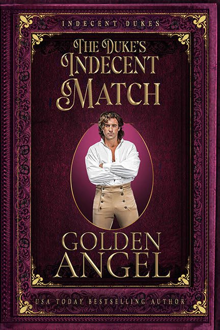
Where do we even start? How about with the duke himself — a man whose stare is as intense as his misplaced modernity. He’s posed with arms crossed in that “gym selfie power stance,” shirt suggestively unbuttoned, channeling less “smoldering aristocrat” and more “guy who just told the Olive Garden hostess he doesn’t need a reservation.”
And what’s that behind him? An aggressively egg-shaped magenta void, as if he’s been copy-pasted into a cameo locket graphic pulled from the darkest corner of a clip art folder. There’s no integration here — no shadowing, no blending, just “Ctrl+C, Ctrl+V, call it a day.” The result? A man who appears to be hovering slightly in front of the design, like a time-traveling cardboard cutout of Fabio’s cousin.
The color scheme isn’t entirely to blame — the deep burgundy and gold are classic romance tones — but then the border goes full fancy frame fever dream with curling filigree, embossing, bevels, possibly a leftover Victorian rug pattern, and just enough metallic gold to make your retinas tap out. Is this a book cover or the lost binding of a cursed library grimoire?
Now let’s talk typography. The title font actually has promise. It’s period-appropriate and elegant, but someone decided to scream “LOOK, I’M CLASSY” in all caps and then crammed the author’s name and “USA Today Bestselling Author” into whatever free corners they could find. The result is a hierarchy mess — no breathing room, no contrast, just text desperately fighting for dominance over a busy background.
And then, there’s the historical accuracy. Or, rather, the total abandonment of it. The fashion is suspiciously clean-cut and generic, the overall vibe feels like a costume rental gone rogue, and if this is truly set in the world of dukes and debutantes, I’m the Queen of England.
Ultimately, this cover is trying to sell us on lusty scandal and aristocratic intrigue, but all we get is a hunky mannequin in front of a Gothic velvet curtain — the kind that might hide a magician about to pull a rabbit out of his breeches.
Final Verdict: The match may be indecent, but the real scandal is this design. A tragic case of time-period confusion, Photoshop purgatory, and marketing misfire. The duke deserves better. And so do your readers.