
Gather round, dear readers, and let us behold The Edge of Tomorrow — not the Tom Cruise blockbuster, but a book cover so visually underwhelming that it’s less “edge of tomorrow” and more “the awkward middle of last Tuesday.”
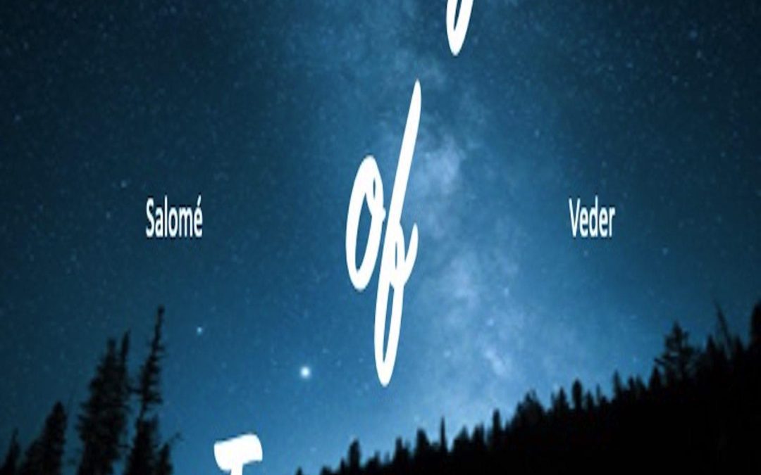
We start with a stretched stock photo of a night sky, possibly pulled from the first page of Google Images after searching “stars but blurry.” This majestic view of the cosmos might have worked — if it weren’t paired with typography that looks like it was borrowed from the “rustic wedding signage” section of Canva. The title font is a casual script that says, “We’ll be serving mason jar cocktails and artisanal cupcakes,” not “Brace yourself for an epic journey to the unknown.”
But wait — the real plot twist is the author’s name. “Salomé” floats on the left, “Veder” drifts on the right, both in a totally different font from the title. It’s as if they were accidentally added to the design by two separate interns who never met each other. The placement makes it feel like the author is split in two and physically leaning out from behind the forest, waving awkwardly to the reader:
“Hi, it’s me! I’m here too. Please notice me.”
And so, what we have here is not a harmonious dance of imagery and text, but rather a hostage situation between three unrelated design elements. The galaxy is vast, but the effort put into this cover is… well, measurable, and not in a flattering way.
If this cover were a movie, it’d be titled Typography Wars: The Font Awakens, and it would be playing exclusively in your cousin’s garage.