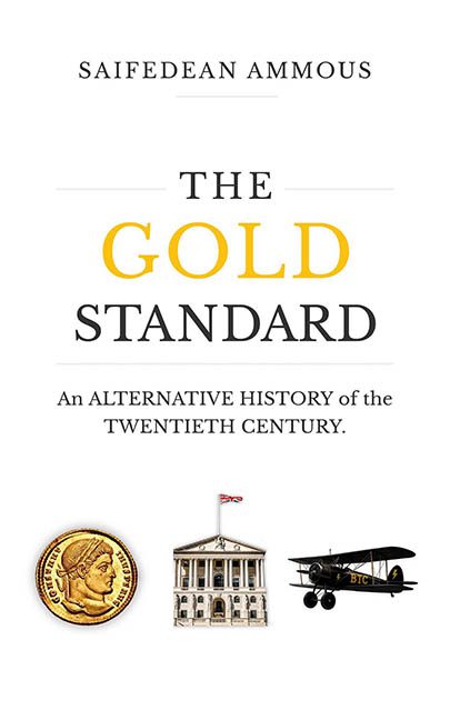
This cover may say The Gold Standard, but it looks more like the “PowerPoint Presentation Standard”, and even that might be generous. If design were currency, this one would be trading below the peso in a crisis.
First, we’re confronted by a title layout that screams “self-published economics thesis” more than professionally designed book. The word “GOLD” is given the only real spotlight — rendered in cheerful yellow like it’s about to sell you a rewards card — while the rest of the text loiters underneath like unpaid interns. “STANDARD” is in black serif caps, trying its best to stand up straight, but everything above and below it is collapsing under the weight of dead space and font confusion.
Then there’s the subtitle:
“An ALTERNATIVE HISTORY of the TWENTIETH CENTURY.”
Italicized, capitalized, and pretentiously understated, as if the book will reveal a grand truth the rest of us were too distracted by design logic to see. It’s the typographic equivalent of someone dramatically whispering “wake up, sheeple” in an economics lecture.
But wait — don’t fall asleep yet. Below the subtitle sits the true star of this disasterpiece: a line-up of badly pasted stock images like contestants at a historical cosplay convention. From left to right:
-
A gold coin from ancient Rome (obligatory “we mean value” symbol)
-
A colonial-looking government building (hello, Bank of England?)
-
And an antique biplane with “BTC” awkwardly slapped on the wing like someone just discovered the text tool and went rogue.
It’s a visual metaphor — unfortunately for the book, that metaphor is “I found these images on a free website and didn’t check the resolution.”
The composition is what happens when someone says, “Let’s keep it clean,” and then forgets that clean doesn’t mean boring. We’ve got miles of unused white space, like the page is trying to socially distance from itself. There’s no rhythm. No hierarchy. Just a stack of fonts and three clip-art refugees floating like forgotten infographics.
Let’s be clear: minimalism can be powerful. But this? This is vacant minimalism — the kind you find in rushed academic publishing, slapped together with a template, a prayer, and a coffee-fueled click through stock image archives.
It’s trying to look authoritative, but instead it’s giving “Here’s my essay on monetary policy, Professor, please don’t look too closely at the formatting.” The layout is sterile. The visuals are irrelevant. And the design? Completely disinvested.
Final Verdict:
This cover isn’t the gold standard. It’s the fiat currency of design — technically functional, questionably valuable, and completely untethered from aesthetic backing.
