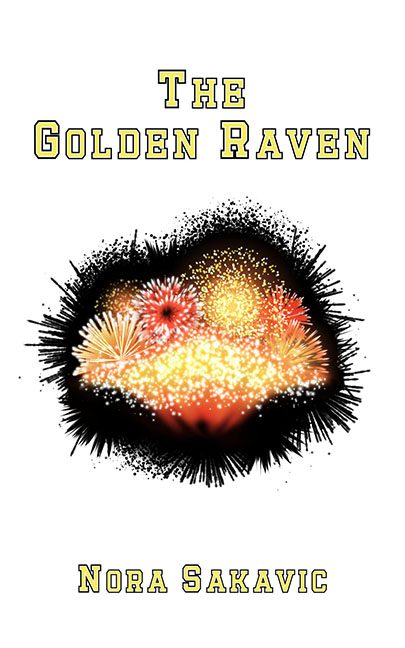
Some titles promise majesty. The Golden Raven suggests something dark, elegant, mysterious, maybe even mythic. Instead, the cover delivers… a firework accident inside an inkblot.
The centerpiece of this design is a chaotic explosion of red, yellow, and white sparkles, like the Fourth of July trapped in a Rorschach test. There’s no raven. No gold. Just a noisy splatter that looks like it belongs on the “effects” page of a bargain fireworks catalog. If this is the golden raven, then apparently it’s already been blown to feathers.
The layout doesn’t do it any favors. The blob sits awkwardly in the middle of an ocean of white space, while the text floats top and bottom like someone forgot to finish the design. Minimalist covers can be striking — this one is just empty, bland, and unbalanced.
And let’s talk fonts. The bold yellow outlined lettering looks like it was lifted straight off a high school sports jersey. The Golden Raven is presented with all the elegance of a linebacker’s practice shirt. Meanwhile, the author’s name at the bottom is just… there. No personality. No flair. Just words, waiting for a design that never showed up.
The verdict? The Golden Raven is a masterclass in unmet expectations. The title promised mystery and majesty, but the cover gave us clip-art fireworks in a spiky ink cloud. If ravens represent wisdom and omens, this one flew straight into the design equivalent of a Roman candle mishap.
