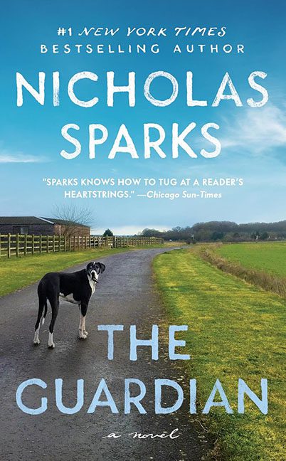
Some book covers whisper, some shout — and then there’s The Guardian, which calmly jogs up beside you and says, “Hey, I’m not that bad,” before revealing it’s wearing five different fonts and a mildly confused expression.
At first glance, it looks professional: a misty countryside, a lonely dog, a moody horizon — classic Sparks. It’s got that wistful, walk-through-your-feelings energy. But once your eyes adjust, you realize this cover is less “emotional journey” and more “PowerPoint presentation on heartbreak.”
Let’s start with the typography, because that’s where the meltdown begins.
There isn’t just one font family here — there’s an entire reunion of slightly similar sans serifs and a surprise script that crashes the party.
- At the top, we get the proud announcement: “#1 NEW YORK TIMES BESTSELLING AUTHOR.” It’s tiny, condensed, and sterile — the typographic equivalent of a flight attendant reminding you to fasten your seatbelt.
- Then comes “NICHOLAS SPARKS” in giant, white, all-caps letters that stretch across the sky like an ego billboard. It’s large enough to be visible from orbit.
- Below that, a review blurb in yet another sans serif font, slightly italicized, trying to sneak in some personality but only managing to look like it wandered in from a travel brochure.
- “THE GUARDIAN” arrives in a heavier, spaced-out version of yet another sans serif, meant to look dramatic but reading more like “default thriller mode.”
- And finally, “a novel” appears in a delicate script font that feels imported from an entirely different book — possibly The Notebook’s scrapbook section.
It’s a typographic identity crisis. Every line is shouting its own emotional truth, and none of them are listening to each other. This isn’t design harmony — it’s Helvetica Hunger Games.
Now, the imagery.
A lonely dog stands in the middle of a winding road beneath a soft blue sky. It’s meant to evoke melancholy and devotion — except the poor creature looks more like it wandered away from a pet food commercial. The fence, the pasture, the distant horizon — all of it screams “royalty-free countryside.” The whole scene feels like it should have a watermark somewhere near the clouds.
And the color palette? A soothing blend of “refrigerator magnet blue” and “real estate lawn green.” It’s tranquil in the way wallpaper is tranquil — passively pleasant but utterly forgettable.
Yet the real punchline is the emotional tone. The Guardian is supposed to sound noble, protective, maybe even a little haunting. But this cover says, “Sunday walk, 10 a.m., bring biscuits.” There’s no drama, no depth — just a gentle confusion about what exactly is being guarded here. (My guess: the designer’s last remaining font choices.)
If you squint, the layout looks clean. But once you see the font anarchy, you can’t unsee it. It’s the kind of cover that looks professional from across the room and like a group project gone wrong up close.
In the end, The Guardian isn’t offensively bad — it’s quietly disastrous. A cover that hides behind serenity while committing five counts of typographic inconsistency and one misdemeanor of emotional blandness.
The dog might be The Guardian, but it’s definitely not guarding this design.
