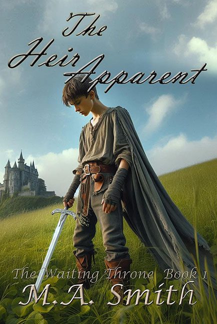
If you’ve ever wanted to see what happens when AI art, bad fonts, and self-belief collide on a hilltop, allow me to present The Heir Apparent. A cover that dreams of high fantasy glory but lands squarely in the uncanny valley — sword first.
At first glance, this seems like your standard fantasy setup: a young prince, a looming castle, some brooding weather, and the promise of destiny. But give it five seconds, and the illusion starts crumbling faster than a novice mage under pressure. The “boy” in question — or whatever humanoid shape our brave protagonist is supposed to be — is unmistakably AI-generated, and it shows. His proportions are doing interpretive dance. His neck’s too long for his torso, his forearms are the size of baguettes, and his hands… oh, those hands. One looks like it’s melting into his sword, and the other seems unsure how many fingers it’s supposed to have. Somewhere between “human” and “wax museum prop,” this heir is less chosen one and more beta version that escaped the rendering lab.
The sword itself appears to have been summoned from a completely different file — crisp, glowing, chrome-perfect, and resting delicately against grass that couldn’t care less. There’s no shadow. No weight. No connection. It’s just there, like an afterthought from a stock photo catalog titled “Fantasy Accessories for Beginners.”
Now, cast your gaze to the castle. Off in the background, lonely and high-contrast, it’s been so perfectly dropped in that it might as well have its own zip code. Its perspective doesn’t quite match the slope of the hill, giving us that signature “Photoshop at dawn” energy. The result? A world where nothing physically connects but everyone’s pretending to get along for the sake of the blurb.
And oh, the typography.
Let’s talk about the fonts, because they’re staging a coup against the artwork.
The Heir Apparent is written in an elegant, swoopy script — the kind of font that belongs on wedding invitations or Etsy candles, not a tale of swords and succession. Below it, The Waiting Throne – Book I hides in ghostly gray italics, barely visible, like a whisper from a forgotten PowerPoint slide. Finally, the author’s name sprawls across the bottom in gold cursive grandeur, glowing like a Hallmark signature. Together, these fonts don’t just clash — they waltz off the edge of taste, hand in misshapen hand.
And yet… it’s all so earnest. You can feel the ambition behind this cover, like someone said, “I’m going to make an epic fantasy image all by myself,” and mid-process, an AI whispered, “Don’t worry, I’ve got this,” before confidently generating five fingers too many.
In the end, The Heir Apparent isn’t just a book cover. It’s a cautionary tale in design form — proof that no matter how noble your intentions, no prophecy can save you from bad hands, bad fonts, and the AI art uncanny zone.
This heir isn’t apparent.
He’s accidentally assembled.
