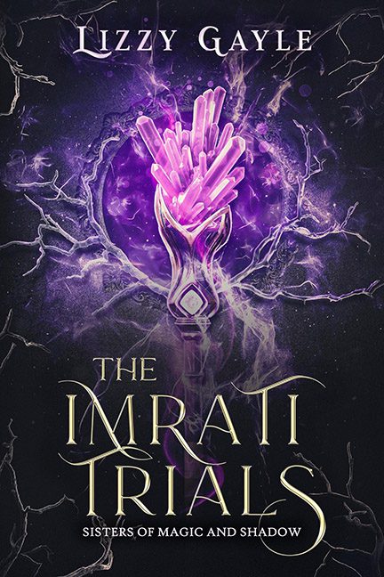
Welcome, brave traveler, to The Imrati Trials, otherwise known as “Fifty Shades of Purple, but Make It Fantasy.” This cover doesn’t just use purple—it weaponizes it. Purple crystals, purple lightning, purple haze in the background that looks like Prince himself exploded mid-guitar solo. Forget subtlety; this is a full-on assault of ultraviolet chaos.
At the center we’ve got what I can only describe as a magical lava lamp, or maybe the kind of “crystal award” you’d win for Best Attendance at a middle school science fair. Is it a hand? Is it a trophy? Is it just a bunch of quartz stuck in a glowing vase? Who knows. What’s clear is that it’s glowing so hard you could probably power a small city with it.
And then there’s the typography. Swirly, curvy, swooshy letters curling into themselves like they’re auditioning for Cirque du Soleil. Every “R” and “S” is doing gymnastics while the word “TRIALS” looks like it’s bracing for impact from the crystal-lava-lamp of doom. The text and image don’t complement each other so much as battle each other to see who can scream “FANTASY BOOK!” the loudest.
The lightning cracks are the cherry on this amethyst sundae—random purple zaps dancing across the cover like your old Windows XP screensaver finally came back for revenge. It’s supposed to scream “magic,” but instead it whispers, “I just discovered Photoshop’s brush tool, and boy do I love it.”
Is it the worst cover we’ve ever seen? No. It’s technically competent. But like a dessert drowned in too much grape Kool-Aid powder, it’s an overdose of one idea with no restraint. If subtle fantasy elegance was the goal, this is more like the visual equivalent of huffing a bag of Skittles.
