Welcome to The Last Hurrah, where the mystery is less who killed him and more who approved this cover.
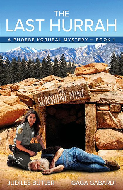
Behold, dear reader: a scene of breathtaking dissonance. In the foreground, a concerned park ranger crouches over what appears to be a gently napping grandpa, both posed in front of The Sunshine Mine, a location that sounds more like a children’s attraction than a murder scene. Behind them, majestic mountains stretch across the horizon, clearly imported from another dimension with zero concern for scale, lighting, or tonal consistency.
Let’s start with our hero. The officer looks like she was carefully cropped out of a police academy brochure and plunked down here without permission. The lighting on her face screams “studio softbox,” while everything else in the image is baked in natural sunlight. Her shadow? Missing. Her emotional investment? Also missing. She’s kneeling beside the old man like she’s deciding whether to write him a ticket or offer him a Werther’s Original.
Then there’s our victim. He’s got the peaceful pose of a man who laid down to test the gravel for comfort and never got up again. His position suggests either foul play or a deep commitment to napping dramatically. The red shirt pops, the jeans don’t, and the Photoshop edges whisper, “I was resized at least twice.”
Now, let’s talk background — because it’s doing the absolute most. The rocks around the mine entrance are hyper-sharpened to the point of looking sculpted from breakfast cereal. The sky is aggressively blue, the mountains are over-filtered, and the forest line in between looks like someone copy-pasted the same ten trees in a hurry. The whole thing feels less like a setting and more like a collage titled Wish You Were Here (But Also Possibly Dead).
Typography? Oh, we’ve got typography.
The title, The Last Hurrah, sits at the top in a plain white sans serif, floating proudly in the sky like a cloud that lost its way. Underneath, a shiny blue ribbon declares, “A Phoebe Korneal Mystery – Book 1,” as if this entire scene is part of a corporate training series titled How Not to Solve Crimes. The author names rest at the bottom, neatly centered on the old man’s legs, which is a bold choice for legibility and even bolder for taste.
It’s a masterclass in tonal confusion. Every element feels like it came from a different genre — the cozy lighting says travel brochure, the pose says crime procedural, and the expressions say “we’re on our lunch break.”
The result? A cover that doesn’t scream mystery so much as mumble miscommunication.
If this is Book 1 in the Phoebe Korneal series, I can only imagine the sequel:
The Second Guess — A Crime Scene in Clip Art Canyon.
In the end, The Last Hurrah is less about solving mysteries and more about creating one: how can a cover look both so sunny and so dead at the same time?
