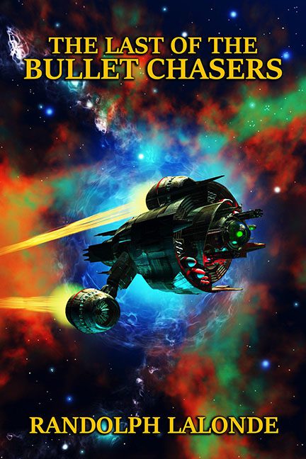
Somewhere in a forgotten galaxy far, far away, a lonely spaceship sails through a technicolor Photoshop apocalypse, bravely carrying the burden of a title so aggressively generic it could only be… The Last of the Bullet Chasers.
Let’s start with that spacecraft, shall we? It looks like a toaster made love to a pair of duct-taped RAM sticks and gave birth to a low-poly nightmare. The rendering is straight out of a 2002 DVD-ROM strategy game — the kind you’d find in a cereal box labeled “Galactic Commander 3: The Reckoning.” It’s not menacing. It’s not futuristic. It’s just… confused.
And then — oh, the background. A swirling gas cloud of cosmic color vomit that screams “Photoshop nebula brush pack: ALL OF THEM, NOW!” We’ve got red, orange, neon green, electric blue — a galactic smoothie of hue choices gone horribly wrong. It looks like a tie-dye shirt had an existential crisis in deep space.
But wait — the real supernova here is the typography. The title “THE LAST OF THE BULLET CHASERS” is belted out in bright yellow Times New Roman like someone panicked during a PowerPoint presentation. It’s sitting there, dead center, doing zero to support the tone, genre, or literal concept of bullet chasing. If this font were a sound, it would be a kazoo playing the Star Wars theme off-key.
The author’s name floats at the bottom in the same banana-yellow hue, like it’s trying to exit the scene quietly without drawing attention to itself — but there’s no escaping this design disaster. It’s not bold. It’s not dynamic. It’s stock font shame on a cosmic scale.
Let’s be honest: this cover isn’t chasing bullets. It’s chasing dignity across a field of outdated rendering techniques and genre clichés. It’s like someone remembered they had a book due and slapped this together with the enthusiasm of a dying printer cartridge.
