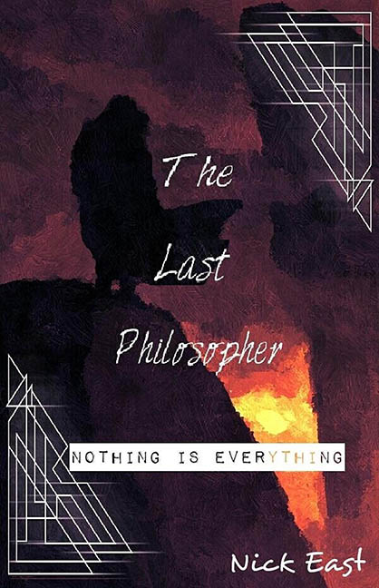
There’s a special category of bad book covers reserved for designs that mistake confusion for depth. The Last Philosopher proudly plants its flag in that territory, presenting a visual identity so muddled it feels less like a cover and more like a design thesis that forgot to explain itself.
Let’s start with the background, which appears to be an abstract painting having an existential crisis. Dark purples, scorched oranges, and inky blacks smear together with no clear focal point. Is that a mountain? A burning void? A philosopher dissolving into the abyss? The ambiguity might be intentional, but intention doesn’t excuse the fact that it reads like a paint filter left unattended. This is not evocative minimalism; this is visual shrugging.
Now to the typography, which commits multiple offences in rapid succession. The title, broken awkwardly into three separate lines, uses a thin, shaky handwritten font that looks allergic to confidence. It’s neither elegant nor distressed in a controlled way. Instead, it resembles someone trying to write neatly while riding a bus. The spacing is inconsistent, the alignment feels accidental, and the overall effect is less “last philosopher” and more “last draft.”
The subtitle, “Nothing Is Everything,” is where things truly derail. Trapped inside a stark white rectangle and rendered in an all-caps typewriter font, it looks like a sticky label slapped on during a moment of panic. It shares no visual language with the title, the background, or reality itself. Rather than grounding the design, it amplifies the sense that multiple unrelated ideas were forced into the same frame.
Decorative line art in the corners adds yet another layer of confusion. These geometric shapes hint at art deco, architecture, or secret blueprints, but they never commit. They don’t frame the composition, guide the eye, or reinforce a theme. They simply exist, like design debris left behind after a concept meeting ended early.
Colour contrast doesn’t help matters. Much of the text blends uncomfortably into the background, forcing the reader to hunt for legibility. A cover should invite the eye, not challenge it to a philosophical debate about whether reading is worth the effort.
Even the author’s name feels like an afterthought, floating at the bottom in a friendly handwritten font that clashes with everything above it. It’s the typographic equivalent of showing up to a funeral in beachwear.
In the end, The Last Philosopher looks less like a professionally designed book cover and more like fridge art for the deeply introspective. There’s ambition here, but ambition without discipline is just noise. This isn’t profound. It’s indecisive. And indecision, no matter how abstract, makes for a truly horrible cover.
