
There’s something poetic about a book called The Lost Journal of Robyn Hood – Outlaw because this cover looks like it’s been lost — not just to time, but to logic, anatomy, and the basic principles of design. If this truly were Robin Hood’s journal, it’s safe to assume he illustrated it himself during a hallucinatory fever dream in the forest.
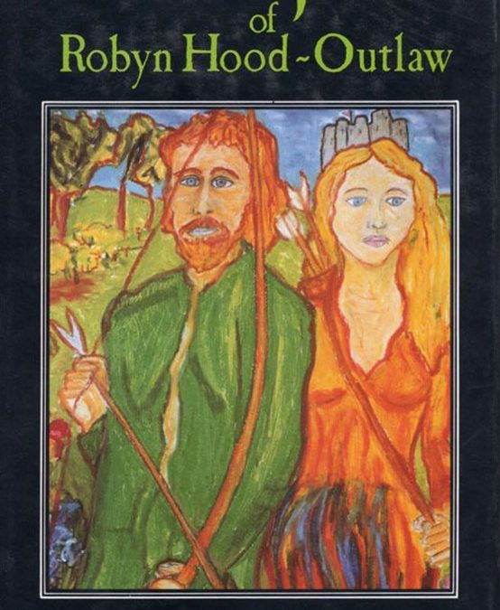
Let’s start with the “art.” At first glance, you might think you’ve stumbled across a kindergarten art show tribute to the Middle Ages. Robin Hood and Maid Marian stand front and center, gazing directly into the viewer’s soul with the unnerving intensity of Renaissance puppets. Robin’s hair, a bright and crunchy orange, defies both gravity and shampoo. His expression suggests that he’s seconds away from realizing his quiver contains crayons instead of arrows. Marian, meanwhile, looks both regal and resigned, like she’s aware she’s trapped in a painting that won’t let her blink.
Their clothing looks as though it’s been ironed flat and colored in with fruit roll-ups. Robin’s tunic is an unbroken slab of neon green, while Marian’s dress features a violent gradient of red and orange, as if her torso is mid-eruption. The painterly style — if we can call it that — features bold strokes that seem to mock the concept of texture. The hands are particularly fascinating: stubby, uneven, and caught somewhere between “human appendage” and “balloon animal.”
The background doesn’t offer much relief. A few trees wobble uncertainly in the distance, one of which looks suspiciously like a piece of broccoli. There’s also what appears to be a castle, but it’s rendered with the geometric confidence of a melted sandcastle. The entire composition feels like someone tried to summarize the legend of Robin Hood after being shown only a five-second slideshow of medieval clip art.
Now, let’s discuss typography — the unsung villain of this already tragic ensemble. The title font is a lime-green serif that might have once graced the cover of a 1990s high school textbook on Celtic myths. It’s neither heroic nor elegant; it’s just green. And that tilde in Robyn Hood~Outlaw? That’s not punctuation — that’s a cry for help. The designer must’ve thought it added flair, but it’s more like the textual equivalent of tripping on your own bowstring.
The framing choice — a thick, oppressive black border — tries to impose order on the chaos but only serves to remind you how much better this would look if it were hidden in a vault. It gives the whole thing the energy of an oil painting that escaped from a hotel lobby clearance sale.
And just when you think you’ve absorbed all the visual chaos, your eyes fall on the bottom line: Edited by David Stuart Ryan. There’s something so formal, so earnest about that line. It’s the cover’s one sober moment, like a news anchor trying to maintain professionalism while chaos erupts behind them.
The tragedy of The Lost Journal of Robyn Hood – Outlaw is that it’s trying. You can almost see the sincerity bleeding through the brush strokes — someone wanted this to be bold, rustic, even mythic. But instead, it became a medieval fever dream rendered in melting crayons.
This isn’t just a bad book cover. It’s a relic. A testament to what happens when artistic ambition outpaces technical ability by several longbows. You can’t look away, not because it’s good, but because your brain is still trying to decode how so many design choices went rogue at once.
Somewhere in Sherwood Forest, Robin Hood is rolling in his grave — and even then, the anatomy probably looks better than it does here.