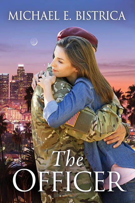
There’s military romance, and then there’s Photoshop Boot Camp: Weekend Edition. The Officer walks straight out of the ranks and into the hall of cover design dishonor, where lighting logic is MIA, proportions are on leave, and subtlety was court-martialed before the first draft.
Let’s start with the couple — front and emotionally center. They’re embracing, yes. Tender? Sort of. Realistic? Not even slightly. This is stock photo energy at DEFCON 1. He’s a cookie-cutter camo man with a beret perched on his head like it lost the will to sit flat. She’s gently gripping his uniform in a way that says, “Thank you for your service, also I’m auditioning for a toothpaste commercial.” Her hair is lit by an entirely different sun, and their shadows? Let’s just say physics has left the building.
Now zoom out to that glorious, jarring background. We’re in… Los Angeles? Or is this an L.A. screensaver from Windows Vista? The skyline glows softly in the magic hour, creating a surreal “romance in a postcard” effect. The moon’s just chillin’ up there, photobombing. And palm trees — lots of palm trees — rise up like confused extras from a budget rom-com set. Is this a heartfelt story of military duty? Or are they about to open a wellness spa together in West Hollywood?
The real tragedy here is the Photoshop slap job. The couple and the background are clearly from two completely different visual universes. It’s like someone dragged the stock photo into a Canva template and called it a day. The lighting doesn’t match. The angles don’t match. The vibes don’t match. It’s like watching two separate films projected on top of each other, and neither has a good plot.
Now let’s address the typography, if we can call it that. “The Officer” floats at the bottom like it’s embarrassed to be part of this. It’s white, it’s serif, it’s safe. It’s also tragically planted right over camo crotch, which isn’t exactly the most dignified place for your title to land. Above, the author’s name hovers in the same font, center-aligned and spaced like a LinkedIn header. The hierarchy? Missing. The impact? Blunted by blandness. The aesthetic? Early 2000s paperback drama from the “bargain bin of feelings.”
And oh, the genre cues. The military uniform. The distant city skyline. The soft, hopeful embrace. You can practically hear the off-screen patriotic music swelling in a minor key. It’s every military romance trope crammed into a single frame with all the subtlety of a bald eagle punching a sunset. The cover’s trying to say “love and honor,” but ends up screaming “I downloaded this from a stock site with only two credits left.”
In the end, The Officer isn’t a love story — it’s a visual casualty. A battlefield of mismatched elements, lazy design, and Photoshop flailing so hard you’d think the program crashed mid-export. There may be bravery and resilience in the pages, but on the cover? It’s graphic design that has most definitely gone AWOL.
Decorated with clichés, armed with awkward cutouts, and stationed in the uncanny valley, this cover serves only one purpose: to remind us that sometimes, the real act of heroism… is hiring a designer.
