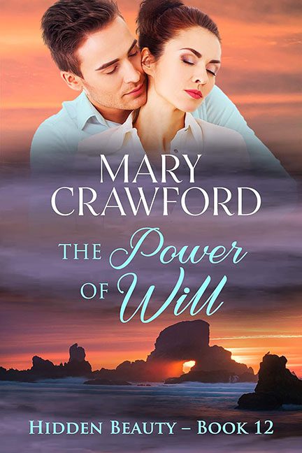
Romance covers are supposed to stir your heart, set the tone, and maybe make you blush a little. The Power of Will attempts all of that — and ends up looking like the ghost of romance novels past, phasing in from the astral plane to whisper, “We ran out of budget, but here’s a beach.”
Let’s begin with the obvious design emergency: the floating couple. These two look like they were cut out of a stock photo library called Generic Intimacy Vol. 3 and then lightly feathered into a sunset background like a DIY memorial collage. He’s gazing at her like he’s about to sell her a luxury timeshare. She’s blissfully unaware, eyes closed, radiating “soft lighting” and mild upper back tension. Are they in love, or trapped in a dream sequence from a daytime soap?
And what’s with the lighting? The couple is sharp, clean, and color-balanced for an entirely different photo session. Meanwhile, the background — a tranquil coastal scene at sunset — is painted in soft pastels, as if it were begging for a watercolor filter to be taken seriously. These images do not live in the same dimension. There’s no attempt to blend them, no shadow grounding them, just a semi-transparent overlay effect that makes the whole scene feel like a crossover episode between The Bachelor and Ghost Hunters.
Now, let’s sail into the typographic typhoon:
-
MARY CRAWFORD arrives in a respectable serif font, placed firmly in the middle of the visual confusion, looking like it’s trying to hold this thing together through sheer force of will.
-
The title, The Power of Will, gets frisky with a curvy, romantic script font that looks suspiciously like it was pulled from a wedding invitation template in 2008.
-
And then, way down at the bottom like a forgotten footnote:
HIDDEN BEAUTY – BOOK 12, in what can only be described as bold blue Arial-in-denial. It’s center-aligned and awkwardly spaced, like it’s slowly backing out of the cover altogether.
It’s not just three fonts — it’s three personalities. None of them match. None of them cooperate. One’s formal, one’s flirty, and one is quietly dying in a footer.
The result? Romantic genre whiplash.
Is this a sweeping emotional drama? A beachy summer romance? A coming-of-age ghost love story? The cover art has no idea, and frankly, it gave up trying somewhere around Book 8.
And about that series placement: Book 12. Twelve. Twelve covers deep into this saga and still no design consistency or visual clarity. This one looks like a placeholder for a movie poster where the lead actors refused to shoot together.
The real power of will here is the viewer’s ability to stay engaged without closing the tab. It’s not the worst design on Earth, but it’s the kind that slides under the radar, hoping the misty sunset and soft forehead nuzzling will distract you from the digital dissonance screaming in the background.
In the end, The Power of Will isn’t so much a romance cover as it is a romantic illusion — one that fades in and out like a memory from a better-designed book. And if this is what “Hidden Beauty” looks like… maybe it should have stayed hidden.
