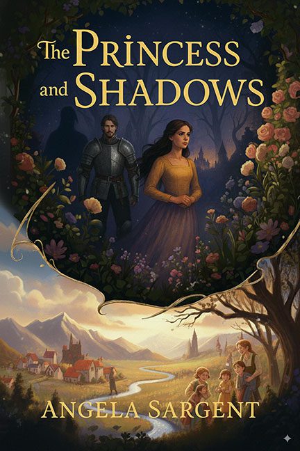
At first glance, The Princess and Shadows looks like a tasteful, storybook-style fantasy cover. A moody knight, a solemn princess, flowers, a dreamy village—what could go wrong? Answer: everything, the longer you look. This cover is a masterclass in “don’t zoom in.”
Let’s start with the knight. He’s standing stalwartly behind the princess in full armor, but then you notice… his shadow isn’t his. That’s not dramatic symbolism—it’s just bad image compositing. His shadow is a whole other man, lurking like he photobombed the shoot and got stuck in post. Nothing says “epic fantasy” like a continuity error you can see from across the bookstore.
Then there’s the village scene below. Ah, pastoral peace! Rolling hills, cottages, and—wait. Is that… a giant? Yes, looming by the river is a figure so out of scale it looks like a kaiju in a medieval rom-com. This dude is about to wade through town like Godzilla on holiday. The castle is barely taller than his boots. If this is the “shadow” part of the title, it’s working overtime.
The composition split is equally jarring. The top half is dark, moody, and floral-framed, like a gothic painting. The bottom half? Bright, cheerful, and Disneyfied, with a family of children staring wistfully into the valley. Instead of blending into a magical panorama, it looks like two completely different covers Frankensteined together. It’s tonal whiplash in JPEG form.
And let’s not ignore the details that don’t line up. The floral border around the princess looks flat, clipped, and awkwardly pasted. The lighting on the princess makes her glow like she’s got her own personal Instagram filter, while the rest of the forest sulks in shadow. The children in the corner? Their proportions are off just enough to make them look like storybook mannequins waiting to come alive at night.
The Princess and Shadows wants to be a fairytale painting. Instead, it’s a game of “spot the Photoshop fail” where the prize is never being able to unsee that giant river man.
