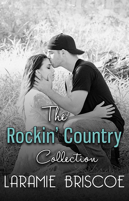
If there’s one thing you expect from a title like The Rockin’ Country Collection, it’s bold cowboy hats, guitars, boots stomping across dusty stages, and maybe a whiskey bottle or two. Instead, what we get is… a washed-out black-and-white engagement photo that looks like it was pulled directly from someone’s Facebook “Forever Love” album circa 2012. Rockin’? Not unless you count gently swaying to the hum of a lawnmower in the background.
Let’s talk about the fonts. Whoever designed this cover clearly took a trip down “Free Fonts R Us” and never came back. First, we’ve got The in a limp script font, floating above the title like it’s lost its will to live. Then there’s the teal, shadowed sans-serif trying desperately to inject “edginess,” but only managing to scream PowerPoint WordArt, 2004 edition. And finally, “Collection” in yet another swoopy script — because why stop at two fonts when you can cram three into one title?
And the photo itself — yikes. A guy in jeans and a backwards baseball cap crouched in a field, tenderly kissing his partner’s forehead, while both of them are drained of all color and energy. If this is country romance, where’s the country? Where’s the romance? Honestly, where’s the color? Rockin’ Country isn’t supposed to look like an advertisement for discount engagement photography.
This cover doesn’t say “music, passion, and drama.” It says, “Ashley and Tyler are registered at Bed Bath & Beyond. Please RSVP to their barn wedding.”
Verdict: This is a horrible cover. A limp, lifeless misrepresentation that took the phrase Rockin’ Country and turned it into Mellow Beige Suburbia. If you’re looking for excitement, you won’t find it here — unless you’re excited about font crimes.
