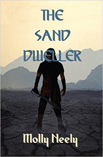
Once upon a time in the vast, cracked wasteland of Microsoft Publisher, a lone warrior emerged — silhouetted, confused, and possibly transparent. Welcome to The Sand Dweller (Original Edition), where minimal effort meets maximum awkwardness in a desert of design despair.
First up: the heroic figure. Or, more accurately, the blurry cutout of a man with a sword, standing on what appears to be a royalty-free image of dry, cracked earth downloaded in 2006. He’s not so much “dwelling” in the sand as he is floating above it like a ghost with commitment issues. The character’s edges are rough, his lighting doesn’t match anything, and his feet appear to have faded into Photoshop limbo mid-project. There’s no depth, no integration, no effort to make it seem like he belongs in this dimension, let alone this book.
The background is a sleepy watercolor of vague mountains — pale, indistinct, and looking like they were softly exhaled by a bored landscape generator. There’s no horizon, no atmosphere, and certainly no heat, despite being a book about sand. It’s the driest desert in existence — visually and emotionally.
And then… the fonts. Oh dear.
“THE SAND DWELLER” is set in an off-kilter fantasy font that looks like a medieval experiment in poor kerning. The letters are arranged with all the grace of refrigerator magnets after a minor earthquake. And then there’s the author’s name — “Molly Neely” — inexplicably rendered in what we can only describe as Ye Olde Spooky Curlz MT. The two fonts don’t match, don’t coordinate, and don’t seem to belong on the same planet. Together, they create a typography cocktail so poorly mixed, it’s basically design moonshine.
To be clear: this isn’t minimalist. This isn’t retro. This is early-aughts eBook energy with a side of “I taught myself Photoshop in a weekend.” The entire cover gives off big “placeholder” vibes — like someone planned to finish it later, then forgot, then uploaded it to Amazon anyway.
Let’s not ignore the overall composition, which can best be described as vertical disappointment. There’s a huge void of empty space at the top and bottom, with the visual weight concentrated entirely in the mushy middle. It’s like a sandwich made with two pieces of air and a single bite of generic warrior.
In conclusion, the original Sand Dweller cover is the kind of art that wanders into your feed, looks you in the eye, and says, “Yeah, I was made in 12 minutes. Fight me.” It’s got no heat, no grit, and no idea what it’s trying to say — but it is confidently holding a sword, so there’s that.
From desert epic to graphic desert, this one dwells squarely in the Hall of Horrors.
