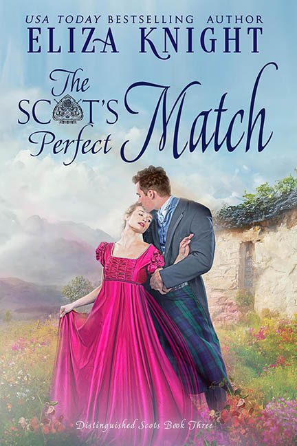
When the title promised “The Scot’s Perfect Match,” we didn’t realize it meant a perfect match for Photoshop’s “Gaussian Blur” filter. This cover is less romance and more romance simulation — like someone whispered “Highlands” into a design app and then fell asleep during rendering.
Let’s begin with the lovebirds themselves. Our heroine is beaming in a dress so violently magenta it could register on satellite. It’s not just pink — it’s “enchanted candy wrapper caught in a lightning storm” pink. And that sheen? Not from satin — that’s digital sorcery, polished to a plastic finish. Meanwhile, our brooding Scot clutches her waist like he’s trying to hold onto the last realistic shadow in the image. His kilt is giving you tartan realness, sure — but his face has been airbrushed into the romantic uncanny valley, where expressions go to die and skin has the texture of a silk pillowcase.
Now zoom out. The couple is pasted into a background that looks like it was borrowed from a greeting card themed around misty regrets. We’ve got rolling hills, a sun-drenched cottage, and a dreamy pastel haze — none of which match the sharp contrast and lighting on the couple. It’s like a paint-by-numbers background clashed with a romance novel LARP photoshoot, and neither side won.
Let’s talk typography. The title “The Scot’s Perfect Match” is contorted into a font marriage that should have ended in annulment. We’ve got a royal crown awkwardly wedged between “Scot’s” and “Perfect” like it wandered in from a clip art directory labeled “British-ish.” “Match” swoops across the cover like it’s auditioning for a soap opera logo. And “Distinguished Scots Book Three”? Tacked on like a post-it at the bottom, just in case you needed a reminder that, yes, this is a series.
And the visual hierarchy? Pure chaos. You’ll be so busy trying to read the swirling fonts and dodge the radioactive dress glow that you’ll miss the crumbling stone cottage in the background — or the meadow flowers that look like they were downloaded in 72dpi and regret their life choices.
It’s all so perfectly imperfect that it starts to feel like satire. The historical romance genre thrives on a bit of melodrama, but this cover cranks every dial to 11: the pose, the glow, the dress, the swoon. It’s not sensual, it’s synthetic.
To be fair, it’s trying — really trying — to be charming, sweeping, and romantic. But the execution lands somewhere between greeting card and graphic novella for the digitally confused. The result? A visual kilting catastrophe wrapped in magenta and crowned with serif regret.
In the great tartan tapestry of book cover design, The Scot’s Perfect Match is a thread that frayed, curled, and then got laminated by accident.
Highland passion? Maybe.
Highland Photoshop fail? Absolutely.
