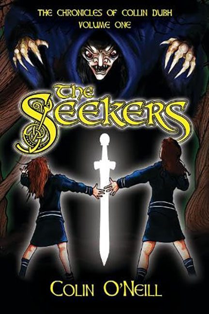
Just when you thought a book cover couldn’t get any worse, along comes a redesign that shouts, “Hold my glowing sword!”
Let’s rewind.
Originally released with a cover that looked like a mid-2000s RPG fan site background, The Seekers launched with a straight-to-VHS visual vibe: two identically posed schoolgirls holding a radiant white sword, while a cackling witch face looms above like a Dungeon Master who’s had too much Mountain Dew.
The title was smothered in chunky yellow gradient text straight from the “medieval WordArt” preset, complete with an unnecessarily ornate “S” that looks like it’s trying to summon an ancient Celtic typeface — and failing. The villain above them? A cross between Nosferatu and a finger puppet from a Halloween clearance bin. Her claws are out, her pupils are gone, and the shading is so harsh you’d think she lived under a tanning lamp powered by bad choices.
The glowing sword? So bright it makes the sun look shy, and yet somehow the surrounding scene remains entirely unaffected. These girls are bathed in blinding light, and still cast no shadows. Physics has left the chat.
But here’s the kicker…
Two months later, this cover was replaced.
And instead of rising from the design ashes like a phoenix, we got… a soggy pigeon.
The new version, in all its flat, white-background glory, is like someone opened Canva and typed “fantasy sword clip art” — and then called it a day. A plain sword leans awkwardly across the page, tangled in thorns that look like angry pipe cleaners. A wilted flower sulks in the corner like it regrets signing up for this. And that tagline? “Only the sword of light can end the darkness.” Unfortunately, it couldn’t end this layout.
The typography’s been dialed back to “early digital publishing,” with the new title font trying to wedge fantasy flair into a layout that has all the drama of a Word doc header. The large ornamental “S” once again takes center stage, this time wrapped awkwardly around a branch like it’s slowly being strangled by regret.
Even the vines look like they’re trying to run away from the composition.
Here’s the brutal truth:
The first cover was a cheesy, overcrowded mess, but at least it tried to have personality.
The second cover? It’s the fantasy version of store-brand cereal — technically present, but completely devoid of texture, style, or taste.
In short:
You started with a Halloween episode of a low-budget teen series.
You ended with a sword on a postcard from a medieval-themed funeral.
Both covers qualify as Horrible Covers for different crimes. The original was a Fridge Art Halloween special, while the new version is flat, boring, and still drenched in awkward choices. It’s like watching someone repaint a graffiti wall with beige and then proudly say, “Fixed it!”
If this is what the sword of light can do, we suggest putting it back in the stone and walking away slowly.
