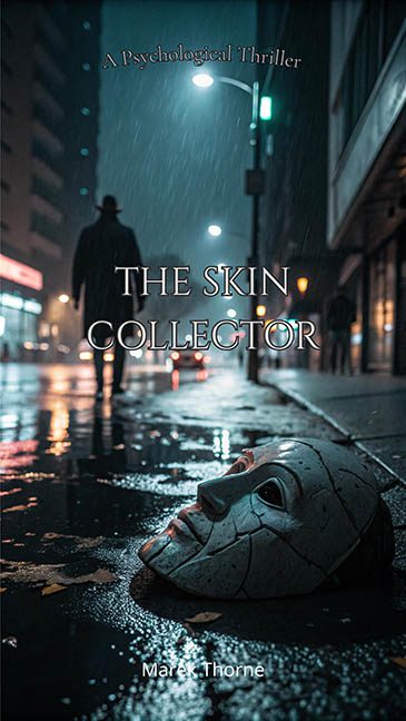
There’s something deeply poetic about The Skin Collector — a psychological thriller whose cover accidentally performs its own psychological sabotage. You know you’re in trouble when the biggest mystery on the cover isn’t who the killer is, but who approved the font.
Let’s give it credit where it’s due: the background image? Actually good. Moody city street at night, rain-slick pavement, a cracked porcelain mask abandoned in the gutter, an ominous trench-coated figure in the distance. That’s a solid noir setup — moody, cinematic, evocative. Unfortunately, the design team must’ve clocked out after downloading the stock image, because everything that came after is a typographic dumpster fire.
First: the title. Set in a default serif font with all the visual intrigue of a faded library label maker, “The Skin Collector” is white-text-over-dark-image 101, but it’s been given a charmingly outdated stroke effect. And not just any stroke — the basic, blunt, no-finesse variety that screams “I just discovered text effects in MS Paint.” The only thing it’s collecting is design sins.
Next up: “A Psychological Thriller.” Let’s talk about this phrase, awkwardly floating above like it’s trying to moonlight as a soap bubble. That arc effect? It’s the typographic equivalent of a scream into a void — misguided, unnecessary, and doing nobody any favours. It’s trying to whisper suspense and elegance but ends up looking like a forgotten text layer someone curved on a dare.
And then there’s the author’s name, poor Mark Thorne, sitting down there on the wet sidewalk like it just lost its umbrella. No font hierarchy, no integration, just plop — name goes here. It’s less “published thriller,” more “local theatre flyer for a cancelled noir drama.”
Here’s the tragedy: the image had potential. It whispered darkness, mystery, and intrigue. But the typography slapped on top is so brutally amateur it breaks the fourth wall and reminds you: this isn’t a movie. This is a cover made in a panic before a self-publishing deadline.
This isn’t a skin collector. It’s a font offender.
If this thriller is half as chilling as its typography, we’re already in psychological distress. Someone collect that font, bury it under a rain-soaked alley, and give this story the gritty, professional cover it actually deserves.
