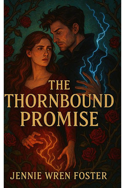
In the garden of book design, some covers bloom… and others get tangled in their own metaphorical brambles. The Thornbound Promise promises a magical romantic epic, but what it actually delivers is a thorny tangle of bad layout decisions, lightning fingers, and a full-scale rose invasion.
Let’s begin with the framing—or rather, the lack of it. The cover features two thick white bars running vertically along each side, as if the artwork couldn’t be bothered to show up to its own full dimensions. It gives the whole piece the vibe of a book caught between a Kindle thumbnail and a Word doc print preview. It doesn’t frame the art; it amputates it.
Now, to the visual clutter. The title says “thornbound,” and boy does the art take that literally. Roses and thorny vines crowd every inch of the border like they’re staging a botanical coup. At first it looks romantic—until you realize these roses aren’t enhancing the image, they’re choking it. It’s less enchanted forest and more “overgrown wallpaper in a cursed B&B.”
Then we come to the main event: the hands. Glowing, spellcasting hands bursting with lightning—one red, one blue, because of course this is how magic works. The lightning effects look like someone dug through a free brush pack labeled “Magic FX – Layer Style Required” and slapped them on with maximum opacity and zero integration. The blue lightning doesn’t reflect on the character’s skin, and the red magic in her hands glows ominously, yet leaves absolutely no lighting impact. It’s not spellcasting—it’s Photoshop sticker art.
And about those characters. Their faces are painted with the intensity of a melodramatic period drama, but their anatomy starts to slip as you move downward. Her hands are doing something, though what exactly isn’t clear—summoning fire? Gripping invisible grapes? Meanwhile, his hand is caught mid-lightning-strike like he’s trying to steal a static shock from a doorknob.
Typography? Not offensive. But not impressive. The title is plopped into the middle like it’s caught between two magical hand gestures and praying it doesn’t get zapped. It’s not integrated into the artwork, just placed there like a well-behaved afterthought.
The entire composition is a study in overcommitment: too many roses, too much magic, too little refinement. Every design element is dialed to eleven, and none of them are talking to each other. It’s like each part of the cover was designed in isolation and then introduced awkwardly at the final meeting.
Verdict: The Thornbound Promise was meant to spark romantic fantasy intrigue, but ends up as a floral Photoshop brawl with lightning bolts and layout issues. If this is a promise, it’s one that needs to be carefully reviewed… under better lighting.
