
When a Book Cover Picks a Fight With Your Eyeballs: The Tip of Your Sword
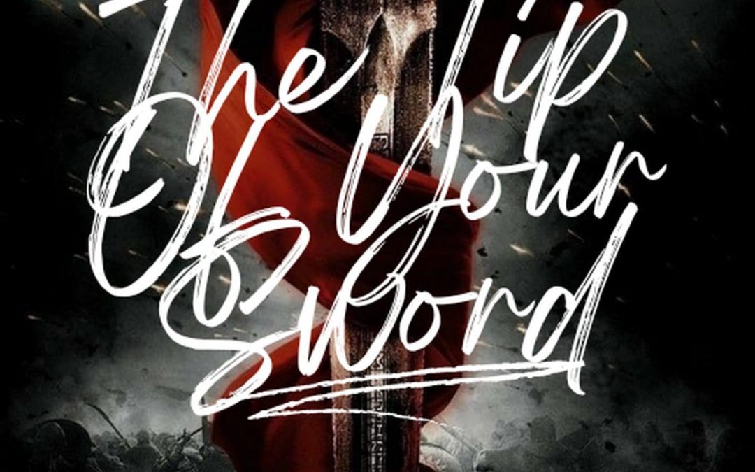
There are some book covers that whisper seductively from the shelf: “Come hither, reader, and discover my secrets.” Then there’s The Tip of Your Sword, which leaps out like an overcaffeinated LARP enthusiast at a Renaissance Faire, flailing a foam weapon and screaming the title in brush script so unreadable it may as well be an encrypted prophecy.
Let’s get this out of the way: the sword is cool. There’s a big, dramatic red cape. There are shadowy soldiers. A battlefield brews in the background. If someone described this to you verbally, you’d be expecting Gladiator meets Outlander, with a touch of forbidden romance.
Instead, you get a cover that looks like Canva had a nervous breakdown.
Let’s talk typography—the real villain here. The title, The Tip of Your Sword, is written in what can only be described as “faux-handwritten chaos.” It’s not just a font choice; it’s a full-contact assault on legibility. The loops and slashes are so aggressive you’d be forgiven for thinking the title was “The Lip Op Yon Sourds.” Which, incidentally, could be a better title if you’re writing Viking erotica.
And then there’s the tagline: “Love hangs in the balance of a war yet to come.” Cool concept. But it’s delivered in a generic font that was clearly selected in a hurry—possibly while blindfolded. It’s the typographic equivalent of whispering “I love you” at a monster truck rally.
The color palette is a swirl of dark moody tones and red accents, which almost works—until you realize the layers are all competing for attention like unpaid extras in a zombie movie. The whole thing feels like a still frame from an overproduced Netflix fantasy show that got canceled after episode three.
What could save this cover?
-
A readable title font, preferably something that doesn’t look like it was scribbled in eyeliner.
-
A clearer hierarchy of elements so the viewer isn’t left wondering what to look at.
-
Restraint. Just a touch. One focal point would be nice.
Until then, this cover will remain a monument to what happens when good ideas are smothered by dramatic excess.