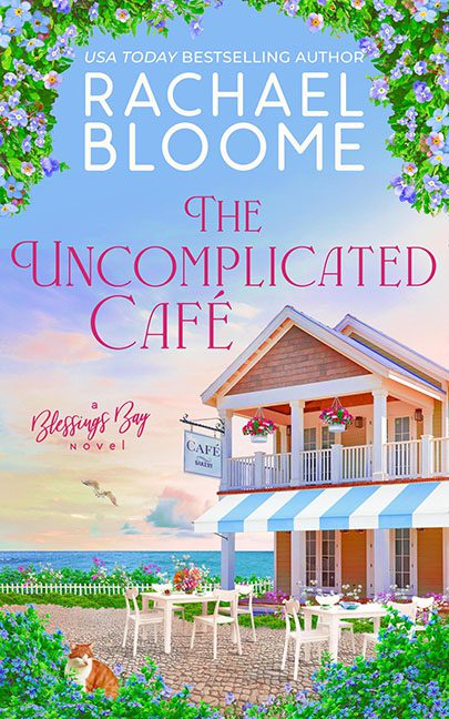
Some covers try to be cozy. Some try to be whimsical. The Uncomplicated Café tries so hard to be both that it ends up looking like a Hallmark postcard designed in The Sims.
Let’s start with the café itself. Perfect siding, perfect balcony, perfect little sign reading “CAFÉ”—this isn’t a real building, it’s a Sims 4 Beach Expansion Pack prefab. There’s no warmth, no texture, no life—just smooth, sterile walls and geometry so flat it could have been rendered on a potato. If this place is “uncomplicated,” it’s because no actual human ever stepped inside it.
Then we’ve got the background. The sky is cotton-candy pink, the water is glowing turquoise, and the flowers are cranked up to nuclear saturation. Instead of serene, it looks like the whole scene was dipped in an Instagram filter called “Pastel Apocalypse.” Birds fly overhead like stock vector decals, while dangling flower baskets scream, “Look! More color! Don’t leave empty space!”
The typography doesn’t help. The Uncomplicated Café is written in curly, overly fancy lettering that clashes with the clean sans-serif of the author’s name. And poor “A Blessings Bay Novel” is shoved in the corner like a neglected afterthought, more logo than subtitle. Cozy doesn’t mean sloppy, but this layout begs to differ.
And then, there’s the cat. Front and center at the bottom of the frame, just sitting there, staring at us like it knows this whole scene is a lie. The cat doesn’t belong, doesn’t interact, doesn’t add whimsy—it’s just… there. Waiting. Judging. Honestly, someone feed that poor thing. It’s the only living creature in this entire cover, and it looks like it’s two seconds away from knocking over the patio furniture in protest.
The result? A cover so oversaturated and overstuffed it’s anything but uncomplicated. The Uncomplicated Café wanted cozy charm but landed squarely in “AI-generated vacation ad meets Sims starter home” territory.
