They say less is more—but The Whiskey Band by Jason Kelly took that advice, tossed in a dripping font, a flashlight, and called it graphic design. Somewhere in these dark woods, there’s a good idea hiding. Unfortunately, it never made it out of the forest alive.
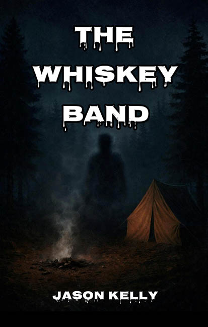
At first glance, the cover promises mystery: a campsite at night, a dying fire, a single tent, and an ominous silhouette lurking in the shadows. It’s aiming for tension, atmosphere, maybe even a supernatural chill. But then your eyes catch the title, and the horror really begins—with the font.
The words THE WHISKEY BAND appear in what can only be described as the official typeface of the Dollar Store Halloween aisle. Each letter is thick, blunt, and inexplicably dripping, as though the text itself is sweating under the pressure of being this over-the-top. What exactly is dripping? Blood? Whiskey? White glue? Who knows—but it immediately deflates any sense of dread the background was trying to build.
This isn’t an eerie woodland thriller—it’s Goosebumps: The Moonshine Edition.
The shadowy figure in the background is technically present, but it’s a masterclass in underexposed ambiguity. Is it a person? A ghost? A tree with commitment issues? You could stare for five minutes and still not be sure. The figure is swallowed by the background fog like the design itself was afraid to commit. There’s a tent—decently rendered—and a firepit, but nothing commands attention. It’s like looking at a stage set before the play starts, except the curtain never lifts.
And then, there’s the author credit, Jason Kelly, rendered in a font that looks like the same dripping goo mess but squished to fit a last-minute deadline. It sits awkwardly at the bottom of the cover like it arrived late to its own haunting.
The overall composition feels like it was designed in the dark—and not metaphorically. The levels are so low, the contrast so flattened, that it becomes a game of “guess what’s in the trees” rather than a compelling visual hook. The tent is the brightest object on the page, which might’ve worked if anything else supported it thematically. But instead, it looks like the cover’s only functioning light source is the last burning ember of good design.
To top it off, the title The Whiskey Band evokes exactly zero horror. It sounds more like an outlaw country trio playing Tuesdays at a dive bar off Route 6. If this is a horror novel, the cover forgot to RSVP to the genre.
Conclusion:
The Whiskey Band tries to conjure campfire fear but ends up dousing its own flames. With its cartoonish type, murky imagery, and tonal confusion, this cover doesn’t scream horror—it sort of wheezes it, in a foggy voice, from under a soggy tarp.
This isn’t a haunting. It’s a case of graphic design gone ghost.