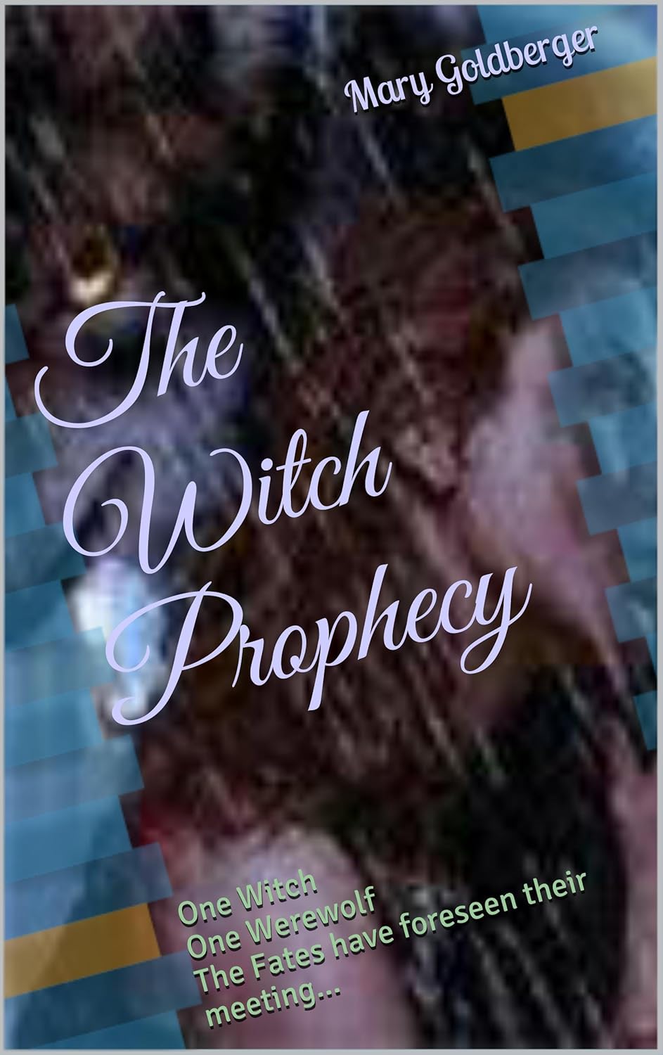
Ah, The Witch Prophecy. You may not know what this book is about—and, thanks to this cover, neither do we. The ancient Fates have apparently foreseen the destined meeting of a witch and a werewolf… but clearly skipped the part where a designer would also join the sacred circle.
First, let’s talk title typography. Nothing says “paranormal intrigue” like lilac script slanted into oblivion, squeezed into an image that seems to be a distorted selfie taken through a frosted shower door. The title tries to whisper elegance, but the background screams “smeared JPEG from 1999.”
Then there’s the color scheme—a daring mix of murky bruises and ghostly aqua rectangles. Is it a magical portal? Is it bad clipart? Is it a Pinterest DIY project gone rogue? Yes.
The real star, however, is the subtitle tagline:
One Witch. One Werewolf. The Fates have foreseen their meeting…
We, too, foresaw their meeting. In a local dive bar. At 2AM. Under fluorescent lighting and mild regret.
If this cover were a spell, it would summon confusion, not readers. But fear not—this is exactly why we exist. Welcome, The Witch Prophecy, to the Horrible Covers Hall of Mystic Misfires.

