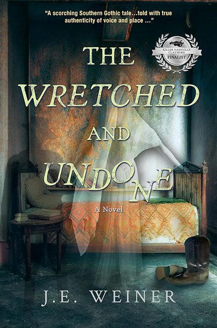
Today we gather ‘round the flickering lantern of bad design to mourn yet another Southern Gothic cover dragged down by the ghost of Microsoft Paint past. The Wretched and Undone promises haunted intensity, literary depth, and backwoods trauma—but instead delivers the visual equivalent of a ghost-themed PowerPoint from 2004 with a stock photo subscription and a dream.
Let’s start with the spectral elephant in the room—our transparent Victorian ghost woman. Hovering in front of the bed like she wandered in from an Edwardian tea party and couldn’t find the exit, she’s less “ethereal lost soul” and more “clipart with opacity at 45%.” You can still see the comforter through her stomach, which either means she’s a restless spirit or someone forgot to layer properly.
The bedroom background itself is… tragic. It looks like a still from an HGTV show called Flipping Cursed Farmhouses. We’ve got a sad little iron bed, a mossy green mattress, and walls that seem to be either water-damaged or soul-damaged—hard to tell. Toss in a sepia-toned glow filter and voilà! Insta-Gothic™.
And then, in the lower right corner, we find the boot. Yes, just one. Placed lovingly in the corner like a product shot for “Haunted Footwear Monthly.” What’s it doing there? Who left it? Is the ghost angry about the lack of a matching pair? We may never know. But it’s definitely not helping the composition, which now reads like an estate sale gone horribly wrong.
Let’s talk typography, shall we? The title The Wretched and Undone is slathered across the cover in a distressed serif font that screams “I googled ‘haunted book fonts’ and chose the first result.” The word UNDONE is slightly italicized and awkwardly spaced, presumably to suggest drama, but it actually looks like it just slipped and fell off the rest of the sentence. Meanwhile, A Novel floats quietly beneath it, apologizing for everything else.
Oh, and let’s not overlook the award sticker hovering awkwardly in the top corner, like it’s trying to escape the haunted bedroom but got caught in the curtain. It’s accompanied by a blurb that says absolutely nothing about what the book is, but says a lot about how much text the designer was willing to cram into the top third of the page.
Visually, this cover is trying to say “haunting beauty meets Southern sorrow,” but ends up looking more like a Halloween party that ran out of budget halfway through decorating. It’s mood without control, atmosphere without clarity, and ghostliness without a ghost of a chance at cohesion.
In conclusion: The Wretched and Undone may be about tragedy, but the true wretchedness was the layout, and the most undone element is the entire design process.
Final resting place?
Hopefully a redesign.
But for now, it’s haunting us all.
