
From the very first glance, this cover is a haunting display of every design decision gone sideways. Three Little Graves & The Big Bad Wolf is the visual equivalent of a supernatural fever dream—a mix of bad choices, poor taste, and unfiltered purple fog.
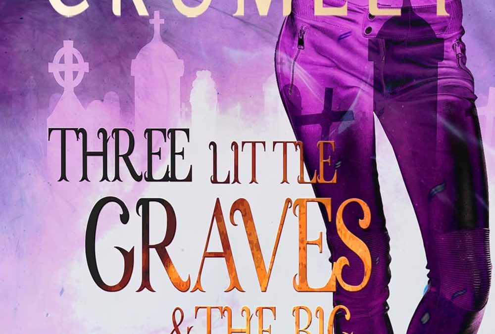
Let’s talk composition. We’ve got a disembodied torso fading into what may or may not be a misty graveyard. A confident hand-on-hip pose suggests this character is ready to take on an afterlife-themed catwalk. But instead of evoking intrigue or danger, the body silhouette—drenched in purples and transparencies—feels like a misguided fashion ad for Halloween leggings that didn’t pass ghost quality control.
The typography, meanwhile, is at war with itself. The title switches fonts like a DJ drops beats, each word in a different style or size, struggling to coexist on the same plane. The words “Three Little Graves” scream gothic-lite, “& The Big Bad Wolf” howls YA romance, and “A House of Graves Novel” just kind of whimpers from the bottom. It’s chaos—font chaos.
Throw in a heavy-handed graveyard overlay and the bizarre choice of ghost crosses projected onto the legs of our floating heroine, and we’re left with an image that feels both over-designed and under-thought. And don’t miss the bold purple “#1” jammed in the corner like a last-minute sticker from a Kindle Unlimited bargain bin.
There’s no mood, no mystery, no menace—just a baffling mishmash of design tropes slathered in lavender mist.
Final Verdict:
This cover doesn’t whisper supernatural mystery—it shouts “Graphic design is my passion!” from inside a smoke machine at a Hot Topic convention booth. It’s a masterclass in what happens when you trust an AI and a bottle of merlot to handle your book launch visuals.