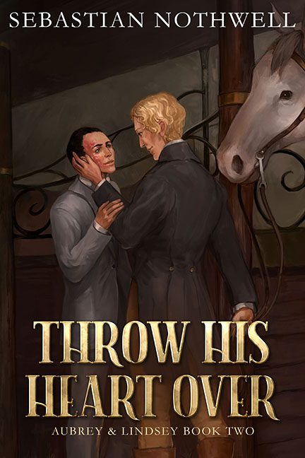
There are covers that whisper sweet nothings… and then there’s Throw His Heart Over, which speaks in the emotional register of a taxidermied Regency romance interrupted by a horse with questions.
At first glance, we’re clearly in historical romance territory — cravats, longing gazes, stable setting. But once the eye settles, it’s clear something’s gone terribly off-bridle. The man on the left looks like he was painted during a particularly slow moment in a wax museum gift shop, while the blond fellow is clutching his lapel like he’s about to dramatically confess to war crimes. The energy isn’t romantic. It’s “I’m sorry, I had no choice”.
And just when you think it’s safe to look away, enter the horse. Positioned like an awkward roommate caught in the middle of a private conversation, its deadpan expression suggests it’s wondering how it ended up in this emotional barnyard showdown. It stares directly at you — the viewer — as if to say, “You saw nothing.”
Let’s not ignore the color scheme: an endless buffet of brown. Brown walls, brown floor, brown horse, brown coats. The entire thing looks like it was painted with a Starbucks gift card. It’s as if the artist feared color might interrupt the solemnity of whatever secret regency crime is being committed in this stable.
Now to the title — “Throw His Heart Over” — a dramatic, passionate phrase begging for a sweeping, candlelit painting or at least a little wind in someone’s shirt. Instead, we get this: a confrontation so stiff, it looks like a deleted scene from a very slow fencing match. And the typography? We’ve got big, bold, beveled gold text that wants to be on the cover of Game of Thrones: The Livery Edition. It’s as if the font wandered in from a medieval battle sim and decided to stay for the melodrama.
Is it badly painted? Not exactly. There’s effort here. There’s anatomy… mostly. But it has that unmistakable Fridge Art aura — the kind where someone’s grandma says “Oh sweetie, I love it!” and tapes it up next to the dry-erase grocery list. It’s charming in a small community theater poster sort of way. But for a professional book cover? This stallion’s lost the race.
