
If you’ve ever wondered what happens when you combine NASA stock photos, early-2000s Photoshop filters, and the design sensibilities of a PowerPoint slide deck, look no further than Time-Travel Tales. This cover doesn’t just whisper “self-published”—it screams it through a tin-can walkie-talkie across a galaxy of clip art.
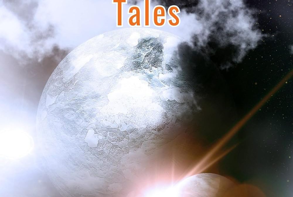
Let’s start with the planets. Are they icy worlds? Gas giants? Ping-pong balls dipped in flour? Hard to say, since each celestial body looks like it came from a different image search, cropped badly, and layered together with all the grace of a middle schooler discovering the “opacity” slider for the first time. And the lens flares. My god, the lens flares. J.J. Abrams is on line one—he’d like his 2009 gimmick back, please.
Then there’s the smoke, which looks like it was pasted in from a “free cloud brushes” download pack circa 2004. Nothing says “epic science fiction adventure” like smudgy mist that could just as easily be mistaken for a vape pen accident.
But the real wormhole of horror here is the typography. Time-Travel Tales in orange with a random drop shadow is bold—but not in a good way. It’s the same boldness as showing up to a job interview in Crocs. The subtitle (Adventure Romance Short Story Prologue – How It All Began) is less of a tagline and more of a desperate plea: “Please, for the love of god, don’t click away—I promise this story is about something.” And then it’s slapped at the bottom in generic white font, as if even the designer gave up halfway through.
If time travel were real, the first stop should be before this cover was made.
Tags: bad book covers, sci-fi book roast, self-published disasters, time travel fail, ugly book design, photoshop gone wrong, lens flare abuse, book cover critique, indie author mistakes, cover roast