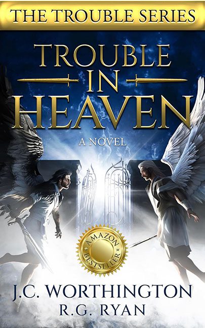
Sometimes a cover is bad in a boring way, and sometimes it ascends into a special kind of chaos that can only be described as “graphic design purgatory.” Trouble in Heaven lands squarely in the latter camp, looking less like a celestial battle and more like a rejected poster for a low-budget televangelist drama.
Let’s start with our leading angels. On the left, the dark-winged brooding one, who looks like he wandered in from a Hot Topic clearance bin. On the right, the “heavenly warrior,” except she’s rocking what appears to be a nightgown borrowed from a historical reenactment. Their poses suggest tension, sure, but it’s less epic clash of good and evil and more “tentative angelic patty-cake.”
Front and center, glowing with all the subtlety of a Vegas marquee, are the Gates of Heaven™. We know they’re important because they radiate a blinding white light, flanked by what looks like a line of blurred backup dancers stuck in limbo. The gates themselves have all the gravitas of a wedding invitation template.
Typography takes no prisoners here. “TROUBLE IN HEAVEN” is stamped in gaudy gold serif, shouting at you like it’s auditioning for a soap opera. Beneath it, “A NOVEL” is tacked on, in case you thought this might actually be divine scripture. And just to seal the deal, an “Amazon Bestseller” sticker floats proudly in the middle, as if that shiny badge can distract us from the visual sermon spiraling out of control.
And then there’s the banner: “THE TROUBLE SERIES.” As if the giant title wasn’t clear enough, we needed a gilded reminder that yes, trouble is not only in heaven, it’s in the series branding too.
The verdict? Trouble in Heaven should’ve been awe-inspiring, powerful, and celestial. Instead, it’s a mashup of mismatched stock models, blinding heavenly gates, and typography so gaudy it feels like divine punishment. This isn’t a cover — it’s a Photoshop altar call gone horribly wrong.
