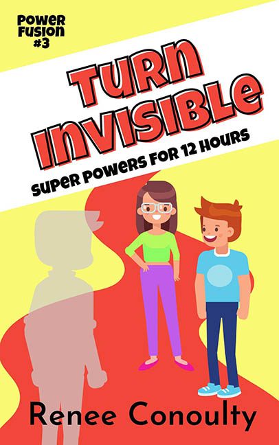
Ah yes, Turn Invisible—a title that sounds like a magical adventure but visually looks like it was designed during a particularly chaotic kindergarten craft session. If this cover’s goal was to disappear into obscurity, mission accomplished.
Let’s start with the design choice that screams louder than the title: that diagonal white bar. It slices across the cover like a rogue napkin at a diner table. Inside it? “TURN INVISIBLE” in a font that appears to be mid-identity crisis—outlined, overly bold, and stuffed into the space like it’s panicking in an elevator. Below it, “SUPER POWERS FOR 12 HOURS,” because nothing says superhuman ability like… mid-tier tagline energy from a cereal box.
But the real stars here are our characters—two kids who appear to have wandered out of a free app called Generic People Simulator: Volume 1. Their expressions? Vacant. Their poses? Straight out of the “standing still” clipart collection. The boy’s hair is doing something… geometric. And the girl is wearing glasses that look like she’s buffering in real life.
And then there’s the pièce de résistance: the “invisible” character. A fully beige silhouette, faded slightly, just awkwardly floating off to the side like a crime scene chalk outline on vacation. This isn’t invisibility—it’s lazy opacity. No special effect, no transparency, no subtle layering—just the same character model filled with sadness and beige. This is less a superpower and more a powerpoint effect gone rogue.
The background? Oh, it’s there. Red, yellow, and… yellow-er. Swirling together in a confused attempt at “dynamic energy” but ending up more like a melted hot dog stand. It flattens the whole design and makes the text even harder to look at. Color harmony has left the chat.
The logo in the top left corner—“Power Fusion #3”—is just chilling up there, bold and unbothered, like it knows the rest of the cover is beyond help. There’s no visual hierarchy, no spacing logic, and definitely no cohesion. It’s a layout held together by hopes, dreams, and a refusal to open a design textbook.
Final verdict? Turn Invisible makes a strong case for why some things should remain unseen. This isn’t invisibility—it’s a vanishing act performed on graphic standards. If this is the power you get for 12 hours, may I suggest spending 11 of them redesigning this cover.
